Search results for

"page builder"

Leadpages vs Instapage: the Landing Page Builder Matchup

Every marketer spending money on online ads knows that, apart from the ad itself, another crucial element of a marketing campaign is where the visitor ends up when clicking on the ad – the landing page. Landing pages serve as the final steps in the funnel, converting the users obtained by the ad clicks into customers by motivating them to take specific actions. Those could be anything from signing up for a newsletter or a free trial, to leaving their contact information or even purchasing a product. While it’s definitely necessary to maximize your ad click-through and efficiency, landing pages are where all the magic happens – their importance in driving your website’s growth and profitability is difficult to overestimate.

Since landing pages are essential to any website looking to grow, powerful specialized toolkits exist nowadays to create, optimize and analyze them professionally. Two stand out: Leadpages and Instapage, being close competitors and market leaders. In order to make a choice in one’s favour, let’s look at the features and costs as our primary decision factors.

Feature Comparison

Being close competitors, Instapage and Leadpages share a large proportion of features which can be considered close substitutes, such as drag-and-drop landing page builders, analytics, and dozens of third-party service integrations, thus we will only mention those which stand out for one or the other.

The essential element of each platform is a drag-and-drop landing page constructor, and both Instapage and Leadpages offer flexible and powerful solutions. There are template libraries available with hundreds of pre-optimized blueprints which can be edited to fit your specific needs, the only significant difference is in the fact that Instapage allows creating a new landing page template from a blank canvas, whereas Leadpages only allows taking an existing library template as the starting point. For those with a clear own design idea in mind a blank starting page might be an easier option than editing a predefined template. Moreover, Instapage allows editing the underlying code of the landing page in addition to the visual interface, which is a nifty feature for the users who are familiar with coding and want to tinker with the fine details of their landing pages.

A feature worth mentioning separately is A/B split testing, which is the process of creating two or more versions of the same landing page and displaying them randomly to your incoming traffic in order to find out which of the versions is more effective at driving conversions. Split testing for landing pages is available on both platforms, yet only starting from the second pricing plan on each (Leadpages Pro and Instapage Professional). Without split testing, the entire concept of landing pages kind of loses half of its value, since the primary idea is to maximize conversions. This is something to consider when choosing between the pricing plans (more on that – in the next section).

Another important distinguishing factor is the ease of collaboration: whether you’re a freelance professional or an agency working with clients – or conducting marketing activities for your in-house needs – it’s rare to work in complete isolation. Each marketing project has various team members and stakeholders, and they should be able to participate in each step of the process seamlessly. In this respect Instapage clearly takes the gold, offering a one of a kind collaboration system with instant feedback and real-time from any member, as well as secure sharing with anyone, from your fellow team members to your client’s legal/compliance depts. This set of features allows successfully eliminating many bottlenecks faced by marketing teams and make the process of landing page roll-out much more efficient. While also focussing on real-time editing, Leadpages doesn’t quite match the power of Instapage’s collaboration interface at the moment.

Price Comparison

Each of the platforms offers three pricing plans, the simplest targeted to individuals and freelancers, the medium being the most value-for-money option for most teams since it includes A/B testing, and the advanced plan focussed on bringing maximum features for large enterprises and agencies.

The starter plans are priced very similarly, with Leadpages Standard at $25 and Instapage Basic at $29 with annual billing. The mid-range solutions with A/B testing included cost $48 per month for Leadpages Pro and $55 for Instapage Professional. Since Leadpages offers significant discounts from its monthly-based billing levels, in case of both packages they have a slight upper hand when it comes to pricing. The most powerful kits pack even more extra features and will set you back $127 per month for Instapage Premium and a hefty $199 for Leadpages Advanced, giving the former a clear lead in this segment.

It is worth noting that Instapage offers a 2-week trial period with full functionality, without having to input your credit card details, while Leadpages does not let you try out the product without making a purchase. You can give Leadpages a test drive by buying one month of Standard subscription for $37 (note the difference vs the annual billing cycle mentioned above) and cancelling any time during that period: the company offers a 30-day money back guarantee.

Conclusion: Which One is Better?

Choosing between Instapage and Leadpages is not an easy task: both offer highly capable and closely similar platforms for building and managing landing pages. After a more detailed consideration, one can see that Instapage is slightly ahead in terms of features, especially collaboration possibilities, while Leadpages is priced slightly lower for both the basic and mid-range plan. Adding the fact that you need to pay up-front to even test Leadpages, though, our preferences go to Instapage in this comparison.

Have questions about Instapage vs Leadpages? Using one or the other (or both) and would like to add your opinion? We’ll be glad to hear it out in the comments section below, let’s discuss!

Paperform Review: Should You Choose This Form Builder in 2024?

Pretty much anytime you need to collect information from your visitors, you’ll need an online form – whether you need to convert leads into customers, or gather RSVPs for an event.

There’s one tool that goes a step further.

Paperform transcends the traditional form builder by letting you create more than a form, more than a landing page – we call it a “landing form”. Think sleek-looking, customizable user data input pages that can analyze form data to increase conversions!

In this detailed review, we will cover the ins and outs of Paperform and discuss the following questions:

  • 🦄What is unique about Paperform?
  • 📊How does it perform compared to alternatives?
  • 💰Which pricing options are available?
  • 👤Who should use Paperform and why?

Before we delve into the details of Paperform, let’s get a quick overview of the product:

What Is Paperform?

Paperform is all about allowing anyone to easily create online forms without any technical knowledge. Thanks to Paperform’s intuitive and visual editor, it makes creating forms as easy as writing an online doc.

Try Paperform for free ›

No matter the need, Paperform’s 300+ templates are versatile and dynamic enough to be used when you find yourself needing an all inclusive tool for the following situations:

  • Feedback and evaluation forms – gather feedback and aggregate the results with a range of integrations. Choose over 20 question types to maximise responses and use the Theme menu to change images, colours, and other UI elements to brand your form.
  • Bookings and appointment forms – use the special appointments question type to accept bookings and appointments and connect your calendar so there are no scheduling conflicts. Defaults like timezone are set for you, or you can use the Configure menu to customize the length of a booking, or, have it calculated automatically based upon respondents’ answers.
  • Lead generation forms – convert website visitors by keeping your leads focused and engaged from start to submission through creating a painless, aesthetic form. You can analyse views, completion rates and find out where your customer dropped off so you can learn from customer behaviour to improve your form and increase your conversions.
  • Safely accept payments – both one-off and recurring subscriptions in multiple currencies through over 1000+ integrations (!) including Stripe, PayPal and Square.
  • Collect data – seamlessly gather all types of data like images, text, files, phone numbers, and signatures. Then, export the data in PDF, CSV, or Word formats to easily manage — forget about the hassles of an excel sheet or legacy database.
  • Generate invoices and quotes – your forms are able to produce automatic purchase documents based on customers’ actions – which means you can email receipts and custom PDFs to your customers without lifting a finger.

How does Paperform deliver on these use cases? Let’s see if there’s anything that makes Paperform stand out from other form builders:

Paperform Features

Paperform makes it easy to create and personalize your online forms and and landing pages. Like most other similar tools, the Paperform builder doesn’t require you to know even the slightest bit of coding to use any of its features.

Conditional logic: forget about rigid forms that have customers exiting out of frustration before they can even submit it. No customer appreciates that, and you’ll definitely score some brownie points by making form-filling a breeze. Paperform’s conditional logic helps you do just that.

This form feature enables your forms to be dynamic and interactive, showing and hiding fields according to respondents’ answers. This means you can create a personalized conversation for a more engaging experience (and hence more form completions).

Paperform: conditional logic

If you want to customize your forms further to really wow your customer, you can opt to have your form pre-fill answers, automatically inserting information from the previous answers.

Third-party integrations: Paperform supports over 1000 of them, allowing you to automate workflows and reduce costs and bottlenecks.

The beauty of this feature is that you can integrate your apps directly so that you can improve the functionality of your forms and increase your productivity. Paperform integrations allow you to collect signatures, store and analyze volumes of data and generally simplify your workflows.

Advanced form analytics allows you to take one look and really gauge the behavior of not just your customers, but all the prospects who have viewed your forms.

You don’t have to churn your own butter, so why manually analyze data sets? Leave this to Paperform Analytics. The dashboard lets you view critical information like completion rates, drop-off questions and forms views at a click of a button.

Paperform analytics

Being able to view form submissions, sales figures and incomplete submissions allows you to better understand your customers and see exactly what question they were up to when they exited the form, meaning you can improve your design, questions or functionality exactly where it’s needed to improve response rates and increase conversions.

Export all this data to the destination of your choice. You can then manage it from Google Sheet, your favourite CRM software, or any one of the 25 analytics apps you can integrate on Paperform.

Calculations can be incorporated into your website, landing pages and forms in a matter of minutes to combine, transform and manipulate answers live on your forms. From simple sub-scores to complex displays of logic, “Calculations” is a special form field in Paperform that you can wield to do a range of things.

Complex price calculations are made easy, automatically calculating and updating costs and quotes in real time based on varying factors.

A form, for example, can use a calculation field to determine the price of a rental period. After choosing room size and length of stay, the calculation updates live on the form.

Document-style builder allows you to create a form with Papeform in much the same way as you would create a Microsoft Word document. Simply type free-text directly where you want it on the page. You can easily and intuitively add questions with logic and add payment/donation fields, or even use HTML/CSS if you’d like:

Paperform doc-style editor

Unlike most other form toolkits, Paperform makes the process of creating a form almost like writing a story. All you have to do is type anywhere onto the page and insert fields – quick and easy, once you get used to the idea.

Speaking of the form builder:

Form Builder, Templates, and Design

To start using the Paperform builder, you can sign up for a free 14 day trial. Simply enter a few details, and you can get creating interactive forms:

Sign up for a 14-day Paperform trial ›

The Paperform dashboard is where users can select create form and choose to either start from a blank canvas or one of the hundreds ready-made templates.

Paperform: start

The available design options range from a restaurant order form template to “What Kind Of Dragon Are You” quiz template… in other words – there will be a format for whatever you need.

After you’ve selected a template, you can customize it as little or as much as you like. Just as you would with a Word document, simply highlight the text you’ve entered to style your text in different headings and fonts.

Once you’ve selected a line of writing, you can insert different kinds of content using the panel that appears alongside it on the left:

Paperform: editor

While most other form builders feature a drag and drop interface, Paperform’s free form editor lets you type your questions wherever you want, just as you would on a Word document. You can click anywhere, type anywhere and easily add pictures, videos, products and more.

You can choose to insert images, embed videos and use breaks to divide the form into different sections of content.

Paperform have made adding questions super simple: select the line and choose the ‘add questions’ option.

From there, you can use any one of the 23 question types including multiple choice, email, and drop-downs. If you then head to the dashboard, you can configure the questions as well as duplicate, move, and delete them.

***

You can also personalize your landing pages or forms in terms of visual style, using an interface that looks eerily familiar to anyone who’s ever used WordPress or a similar CMS:

Paperform styling

The ‘Theme’ menu is where you can pick the overall theme of your form or page, play with colours, and change the fonts, logos and buttons.

Paperform also has a feature allowing you to import themes which is a huge score if you want to create multiple forms with identical design and saves you from needlessly re-creating your favorite form.

Sounds great for far! Where can all this form goodness be used? The answer is: almost everywhere 🚀

Paperform Use Cases

Regardless of your field of activity, if you need to collect information from site visitors, Paperform has got your back:

Running a small business is hard work and you often have a finger in every pie. Paperform has made it super simple for anyone to kickstart their business online by creating forms and landing pages in a matter of minutes without having any technical skills.

Collecting information from your customers is a breeze through the generous selection of question types such as e-signature, eCommerce products and email. The forms are easily customizable to match your branding.

Convert more real estate leads by creating aesthetic, user-friendly forms that also have the ability to automatically send invoices and follow up emails, automating your workflow so you can spend more time doing the important things — selling houses.

Accepting payments and subscriptions is just as easy — Paperform integrates with popular payment services like Stripe, PayPal, and Square. After a purchase is made, a custom PDF receipt can then be automatically sent to your customer. Customers can select multiple products, and pricing can be calculated automatically based on certain criteria, helping to manage your inventory — so you don’t have to.

Organising events requires a lot of multitasking. With end-to-end automation available to manage registrations, vendors, ticketing and reporting, event management is made simple. Conditional logic allows a smooth registration process so you can collect important information all in the one place.

Don’t forget to check in on the success of your forms using the analytics dashboard 📈 Measure views, completion rates and see where your respondent dropped off answering their question.

Oh, and don’t worry, your forms look great on any device (well, maybe apart from a smart watch)

Marketing automation, i.e. any activity that deals with collecting leads and converting them into sales on a massive scale is another important field of application for Paperform.

Simple fact: easy to use, appealing forms and landing pages convert better. With Paperform, you can leverage the analytics dashboard to monitor performance and gain deeper insights into your customers’ behaviour. Create a seamless customer experience, tailored to the individual user to boost your conversion rate through using conditional logic.

Built-in email automation means you can easily set up automatic responses to be sent to everyone who interacts with your forms and landing pages. With over 25 messaging and email app integrations available, you can schedule your emails and SMS’ in advance — you’ll never have to manually send an email again.

As a cherry on top, a huge time-saving benefit is the ability to easily transfer form data and leads to any one of the 130+ CRM tools, including Hubspot and Marketo – no repeated manual work required.

Pricing: Should You Get Paperform?

As we mentioned earlier, Paperform is free for the first two weeks; after that, you can choose between one of the three available subscription plans:

The Essentials plan starts at $15 per month ($12.5 with early billing) and is ideal for businesses which want to create simple forms and don’t expect too many users or submissions.

If you use online forms on a regular basis and want the maximum benefit of all available features, the Pro and Agency plans allow you to take your form making to the next level with the ability to add fields such as calculations and scoring.

Paperform pricing

If you belong to a registered NPO or charity, you can apply to receive special discounted Paperform subscription prices. “Pay what you want” is offered on the Pro tier and the Agency tier is discounted at 50%.

Regardless of your needs, it is recommended to give Paperform a spin before committing to a subscription; the 14-day trial is definitely a good idea:

Try Paperform for free ›

In any case, now you have more information to decide whether Paperform is right for you. If you’re after a hassle-free, user-friendly form builder with serious extension and intergration options, this might be the one.

Full JotForm Review (2024): Should You Use This Online Form Builder?

☑︎ This review was last updated in April 2024

Ah, online forms! One of those things you don’t know you need – until you need it really badly.

JotForm is one of the most popular solutions for this situation… but since you’re reading this, you are probably also wondering:

“Building and managing online forms sounds like a hassle! A great tool should be simple to use but also meet my specific needs and requirements. Should I trust JotForm to do the job?”

Let’s find out together. In this detailed review, we will analyze JotForm from every possible angle and cover the most popular questions –

  • 👶Is JotForm easy to use for beginners?
  • 🔒Security and privacy – should you trust JotForm?
  • 💸Which pricing plan should you choose?
  • 🏆Is JotForm better than the alternatives?

Before we discuss the unique features that distinguish JotFrom from alternative services, let’s get a quick overview of the service itself:

What Is JotForm?

Forms are everywhere! Every time an organization needs some kind of input from a large number of people – be it customers, employees, supporters, students, etc. – it uses some sort of form to collect this information.

The main idea behind JotForm is to make the entire process as easy as possible: from actually building the forms, to managing the gathered data.

…And it’s not just about surveys – the range of possible uses for JotForm also includes the following popular scenarios:

  • Applying or registering for events, jobs, scholarships, memberships – even loans or housing. Simplicity 🎯 is key here, since there’s typically a lot of information to be collected from a single person in such cases.
  • Giving feedback or evaluation, which also includes filing complaints, leaving reviews or ratings, or voting on a decision. Clarity 🔮 is critically important here, as well as the ability to analyze the data to form insights.
  • Getting in touch with an organization (or public figure) in order to ask a question, offer cooperation or simply share an idea. Since this type of form is often used by strangers first-time visitors, privacy 👁️‍🗨️ and data protection become additional concerns.
  • Making a reservation, which can mean anything from booking a table or scheduling an appointment, to hiring various services, to vacation rentals. Getting started with this type of form is much easier via ready-made templates 📑 that include all the necessary fields and interactions.
  • Obtaining new business prospects, both online and offline; the latter also implies the ability to use the forms on a variety of devices 📱 such as smartphones and tablets.
  • Ordering a product or service online is one of the use cases you wouldn’t typically expect from an online form builder, but JotForm possesses sufficient security 🔑 and payment integrations to build surprisingly efficient checkout forms.

…and we haven’t even mentioned niche cases and special requirements, such as collecting sensitive health data from patients! (e.g. under HIPAA in the United States)

JotForm promises to solve each of those challenges – but does it actually deliver? Let’s see what’s so special about this tool.

Unique Features of JotForm

Of course, JotForm is not the only way to build online forms – so are there any specific advantages to using it?

Actually, there are quite a few:

  • Conditional logic makes it possible to “teach” your form to react to the user’s inputs, automatically adding, removing, hiding, skipping or changing fields in response to specific answers.

You can also use any field the respondent completes as an input for the rest of the form – e.g. to alter the labels or recalculate values of other fields!

This opens up almost limitless possibilities for making your forms even more effective, e.g. easily building highly personalized thank-you pages:

JotForm: conditional logic

And yes, conditional rules are present (to some extent) in most form builders, even Google Forms – but none comes even close to JotForm in terms of flexibility.

  • Apps and integrations library is what really makes JotForm exponentially more powerful, by connecting your forms with hundreds of third-party services.

This allows you to add various cool things to your forms (like signatures or additional verification), export form data into your favorite project management or analytics tools, and even securely collect payments without the need for expensive e-commerce solutions!

Speaking of security:

  • Data protection and privacy features ensure safety both for the creators and the respondents: JotForm uses 256-bit SSL certificates on all forms and lets you decide exactly who can fill in the form and who can see the results.

You can also choose to additionally encrypt all form responses with an RSA-2048 key before they are submitted to you, which acts as a double insurance against anyone trying to intercept your users’ data.

In order to enable encryption, you will need to go to your form’s settings and click on the brown “Show more options” button.

In addition to these security features, we should mention several abbreviations that might sound familiar to you. Here goes:

JotForm is fully compliant with GDPR (European data protection laws) and PCI (for payment processing) – and if you need to collect health-related information from your respondents, you can upgrade for HIPAA compliance.

  • Advanced publishing options give you full freedom when it comes to delivering your forms to your audience. Again, JotForm really raises the bar here, compared to other similar tools:

There are numerous ways you can publish a form created in JotForm – as a direct link, a social media post, or even a fillable PDF document –

JotForm publishing

You can also email the form directly to your respondents or embed it into your website – the specific code for each popular web platform like WordPress or Shopify is generated for you automatically.

  • PDF constructor is another unique feature of JotForm that lets you easily convert form responses into professional-looking PDF documents – ideal for generating invoices, proposals, tickets, certificates, etc.

The best part here is that you don’t need to start from scratch: there are hundreds of ready-made PDF templates at your disposal.

…Which brings us to the next aspect of JotForm:

  • Template library contains thousands of pre-made forms for just about every situation, grouped by type and industry. A huge time-saver!

To better understand the role of templates in JotForm, let’s take a closer look at how the form builder itself works:

Form Builder and Templates

Getting started with JotForm is super simple: you can create a new account by filling in your name, email, username, and password – or even faster via the Facebook or Google sign-up:

Create a Free Account at JotForm ›

It takes about 30 seconds in total, and we’re ready to begin! Let’s click on the big green “Create Form” button and explore our options –

There are 3 ways to create a form: starting from a blank canvas, using a template, or importing an existing one (from a website, your JotForm account, or a PDF document).

In day-to-day situations you will most likely be using templates – they save so much time! – but for the sake of introduction it might be better to start with a clean slate 📖

The form builder has a simple interface that conceals a surprisingly rich array of tools and powerful features:

JotForm builder

You can add new fields and other elements by clicking on the dark-grey rounded button on the left on the screen [1] which opens an entire panel of various things you can use in your form.

Apart from the basic elements and payment gateways, take note of the third tab which contains a huge number of more advanced blocks, like automatic geolocation or taking a photo of the respondent.

If you click on an existing field, a circular cog button will appear [2] that opens the field settings panel. Here, you can change the label, size, and position of the field, as well as marking it as required.

The third important panel is for the overall form design – it’s opened by the blue paint-roll button [3] in the top right corner of the interface.

To be frank, this part of JotForm’s builder was the biggest positive surprise for us; the variety of options is far beyond anything we’ve seen in other form builders:

  • You can choose colors and backgrounds for every individual part of the form – or click on the button at the bottom to activate the advanced designer interface with a mind-blowing amount of additional granular settings.
  • You can adjust the form’s fonts, size, and position – and even add your own CSS code if you’re familiar with web development languages.
  • OR you can simply choose a ready-made visual template for your form! There are both free and premium themes available in JotForm’s store.

…While we’re still in the form builder, have you noticed the JotForm banner at the bottom of the screen? [4] It will appear on all forms published using the free account.

In order to remove the banner from your forms, you’ll need a subscription. How does it work? And is it worth the money? Here’s the gist:

JotForm Pricing

The nice thing about JotForm is that it’s a so-called freemium service – in other words, it has both a free and a paid version.

This means you can start building and using your forms without any financial commitments, and later upgrade if JotForm proves to be useful for your project.

What we particularly like about JotForm is that there is absolutely no difference in features between the free and the paid plans: you only need to pay for additional usage limits and for removing the branding below the forms.

With this in mind, the logic behind JotForm’s subscription plans is quite straightforward:

JotForm plan Free Bronze Silver Gold
Monthly cost $0 $24 $29 $79
Form limit 5 25 100
Responses per month 100 1,000 10,000 100,000
Available space 100 MB 10 GB 100 GB 1 TB
JotForm banners yes no no no

As you can see from our summary table above, JotForm scales together with your needs – while not putting any limits on the functionality.

Another thing worth noting is a 50% discount for registered non-profits and educational institutions, which is something you won’t find at other online form providers 🎓

Finally, JotForm offers a 30-day money-back guarantee on any paid plan, which means you can ask for a full refund during the first month, by contacting the support team using the contact form or via email (they reply 24/7).

Neat! By now we pretty much have all the information we need to answer our main question:

Should You Use JotForm?

There’s no doubt – JotForm is by far the most advanced form builder service we’ve laid our hands on (and we at Satori Webmaster Academy have tried them all).

Long-time readers of our blog will know that we especially like products which manage to stay simple and intuitive while packing powerful features that are good enough to satisfy even the most expert users

JotForm is one such product. Its online builder is easy to use for beginners, but gradually reveals a huge variety of options and capabilities as you get to know it better.

Every single feature is available in the free version of the service, which means you don’t have to pay anything until you’re really sure JotForm is the right toolkit for your needs:

Start using JotForm for Free ›

We initially expected JotForm to be a complicated tool for the more demanding cases – now we’re using it across the board, even for the simplest, text-only forms (bye-bye, Google Forms!)

Regardless of whether you’re a solo entrepreneur or a part of a big team, JotForm makes it surprisingly easy to forget that online forms used to be a difficult and tedious task.

***

We hope this review was helpful and answered more questions than it created! Share your thoughts and opinions in the comments section below – let’s help each other make a sensible choice 💬

Das ultimative -Review 2024 – nur ein weiterer Homepage-Baukasten?

☑︎ Dieses Review wurde zuletzt aktualisiert im April 2024

UPDATE: wir haben zu den verschiedenen Preisoptionen von Webflow eine detaillierte visuelle Erklärung hinzugefügt. Du kannst sie in der entsprechenden Sektion weiter unten finden; Wir hoffen, ihr findet das genauso interessant wie wir, als wir sie zusammengestellt haben 🤓

***

Du bist wahrscheinlich hier, weil du dich fragst: „Sollte ich Zeit investieren, mit dieser neuen App umgehen zu lernen?“ In unserem detaillierten Review wirst du alles erfahren, was du wissen musst, um eine Entscheidung zu treffen.

Dadurch, dass wir jede der vielen Komponenten aus Webflows Angebot wie Designer, CMS, Hosting, eCommerce, etc. auseinandernehmen, werden wir am Ende herausfinden können, ob es ein Tool ist, das sich lohnt, sowie einige der drückenden Fragen derer beantworten, die bereits ein Auge auf Webflow geworfen haben:

  • 📐Ist Webflow benutzerfreundlich – und wer sollte es nutzen?
  • 💰Wie funktionieren die Preisoptionen wirklich?!
  • 🔌Ist Webflow kompatibel mit anderen Werkzeugen?
  • 🏆Solltest du Webflow traditionelleren Tools vorziehen?

Der Eckpfeiler der Philosophie von Webflow lautet „cleveres Weglassen von Code“ – dieses Werkzeug wurde speziell für Leute entwickelt, die eine Website erstellen und dabei den Quellcode der Seite am liebsten nicht anfassen möchten, aber dennoch mit aufgeräumtem, gut geschriebenem Code arbeiten möchten und dabei nicht an eine einzige Veröffentlichungsplattform gebunden sein wollen.

Teste Webflow kostenfrei ›

Hier gibt es gute Neuigkeiten für die, die mehr von der visuellen Sorte sind, denn eine solche Herangehensweise könnte Designer dazu ermutigen ihre Vorstellungen direkt im Web Wirklichkeit werden zu lassen und so eventuell sogar Grafikprogramme wie Photoshop oder Sketch zu überspringen.

Ob das nun die einzige Anwendungsart von Webflow ist und ob das in der Praxis auch tatsächlich so gut funktioniert, werden wir im Folgenden genauer unter die Lupe nehmen:

Blitz: Oft gestellte Fragen

Doch bevor wir richtig eintauchen, hier noch eine Zusammenstellung der am häufigsten gestellten Fragen, die uns bezüglich Webflow erreicht haben – mit knackigen Antworten, die euch auf die relevanten Teile dieses Reviews weiterleiten:

— Was ist Webflow? 🤔

Im Grunde handelt es sich bei Webflow um ein Online Toolkit für das Erstellen und Betreiben von Webseiten. Ein strahlender Hybrid aus traditionellen Website-Erstellern wie Wix, klassischen Content Management Systemen wie WordPress und dem tatsächlich „von Hand“ programmieren der Onlinepräsenz.

Schon verwirrt? Der Leitfaden, den du gerade liest, wurde mit dem Ziel erstellt, dass die Verwirrung aufgelöst wird! Und der beste Weg, um damit anzufangen, ist sich die Hauptbestandteile des Webflow-Toolkits anzusehen, darunter den Website-Designer, CMS, und Veröffentlichung/Hosting.

— Wie viel kostet Webflow? 💳

Das ist tatsächlich eine sehr gute Frage und vielleicht die, die am schwierigsten zu beantworten ist. Aber anstatt jetzt eine große Rede zu schwingen, haben wir uns dazu entschieden eine Grafik zusammenzustellen. Du kannst sie dir in der Sektion zu der Preisgestaltung ansehen, indem du diesem Link im Text folgst.

Kurz gesagt gibt es zwei Preis-Ebenen bei Webflow: Abonnements für einen ganzen Account oder Abonnements für Webseiten. Erstere bestimmt, wie viele Teammitglieder Webflow verwenden können und außerdem für wie viele Projekte; die Website-Abos hingegen sind tauglicher für höheren Traffic und eCommerce.

— Ist Webflow einfach zu benutzen? 🙉

Naja, die Antwort wird dich vermutlich nicht überraschen, denn sie lautet: „Wenn du erstmal weißt wie es geht, geht die Verwendung sehr gut von der Hand”. Ja, die Lernkurve ist etwas steiler, als es beispielsweise bei Wix oder Squarespace der Fall ist, aber als Lohn für die Mühen profitierst du von einem viel flexibleren, anpassbaren und machtvolleren Werkzeug.

Aber darauf werden wir in den kommenden drei Kapiteln noch genauer eingehen, die sich spezifisch mit der Hauptfunktion von Webflow befassen:

Webflow Website-Designer

Webflows Angebot besteht aus drei Hauptkomponenten: das von Programmiersprache freie, visuelle Webdesign-Tool, das Content Management System (CMS) und das Hosting. Ersteres ist wohl zweifellos die „Flaggschiff-Funktion“ des Service. In diesem Abschnitt nehmen wir den Webflow Website-Designer genauer unter die Lupe.

Was ein bisschen wie eine Photoshop-Oberfläche aussieht ist tatsächlich mehr ein HTML/CSS Automatisierungswerkzeug, bei dem der Anwender frei nach Belieben Elemente hinzufügen, positionieren und verändern kann, während das zugrundeliegende System automatisch das Markup und den ganzen anderen nötigen Code generiert. Das Interface ist relativ Komplex und es dauert etwas, bis man sich daran gewöhnt. Dennoch ist es zweifellos einer der mächtigsten und vielseitigsten Website-Ersteller, der heutzutage existiert.

Lasst uns das gleich zu Beginn klarstellen: du kannst nicht einfach eine Form auf eine Art leere Leinwand malen. Statt irgendwie naiv eine Website aus dem Boden zu stampfen, verheimlicht Webflow nicht, dass hinter jedem Element richtig echtes Programmieren und Code steckt, und auch, dass dieser Code zunehmend unübersichtlich wird, wenn man nicht mit in Betracht zieht, wie HTML und CSS arbeiten und funktionieren.

In anderen Worten: um in die Mitte der Website einen Kreis zu malen, musst du ein neues <div> Element (einen „Container“ oder eine „Sektion“ in Webflow-Termini) hinzufügen, seine Position als „festgesetzt“ definieren und seine Oben-Rechts-Unten-Links-Position als 0 bestimmen – das ist das echte Leben, Freunde!

Ja, die Arbeitsoberfläche von Webflow bietet echte CSS-Eigenschaften. Um also die Möglichkeiten dieses Tools voll auskosten zu können, solltest du dich mit HTML/CSS auskennen. Solltest du allerdings beim Anmeldevorgang einen Haken in das Kästchen mit „Ich kann mit Code nicht umgehen“ setzen, automatisiert Webflow einen Großteil des Editors für dich. Es kümmert sich beispielsweise um Media Breakpoints, um ein passendes Verhalten der Website zu gewährleisten (wie das Erstellen von entsprechendem Code für die Darstellung der Seite auf Smartphone oder Tablet).

Mit Media Breakpoints und Geräteansichten in Webflow arbeiten

Es ist wohl unnötig zu sagen, dass es unmöglich ist, jedes CSS-Feature in den Editor zu quetschen. Aus diesem Grund vereinfacht Webflow die unnötigsten und am seltensten verwendeten Parameter und macht das Ganze benutzerfreundlicher: angefangen bei einem Angebot vordefinierter Optionen, bis hin zum Möglichen an- und ausschalten der Anzeige von „fortgeschrittenen“ Features und einer direkteren, detaillierteren Kontrolle und Steuerung der Vorgänge.

Es ist möglich mit einer komplett leeren Umgebung zu starten, oder aber eine der verfügbaren Vorlagen zu wählen, von denen einige sogar bereits eine startklare Seitenstruktur mitbringen. In der Webflow-Bibliothek gibt es über 30 kostenlose und 100 Premium-Vorlagen. Der Hauptunterschied zwischen diesen beiden Kategorien ist das Level an Details, sowie beinhaltete Boni wie Styles und Bilder. Die kostenpflichtigen Vorlagen liegen bei 40$ bis 80$ und sind Kreationen der Webflow-Community, also von professionellen Designern und Entwicklern außerhalb des Unternehmens kreiert.

Aus oben genannten Gründen empfiehlt sich der Beginn mit einer leeren „Leinwand“ eher für diejenigen, die bereits einiges an praktischer Erfahrung mit HTML/CSS mitbringen und kein Problem damit haben die diversen Bausteine von Null an aufzubauen. Wenn du vorher noch nie programmiert hast oder dich einfach zunächst etwas mit dem Webflow-Baukasten bekannt machen möchtest, ist es sehr zu empfehlen erst einmal ein bisschen an den zur Verfügung stehenden Vorlagen herumzuspielen.

Abgesehen von statischen Inhalten, sind auch Animationen ein essentieller Bestandteil des Webflow Design-Tools, was das gewisse Extra an Interaktivität auf die Website bringt, aber mit traditionellen Tools auch nicht besonders angenehm zu implementieren und zu testen ist. Zu aller erst kannst du Übergänge und Transformationen zu jedem Element direkt hinzufügen, indem du die Eigenschaften des Elements über das rechte Seitenmenü bearbeitest. Das ist übrigens enorm zeitsparend, da das Schreiben der meisten dieser CSS-Regeln von Hand äußerst nervig ist und die meisten Entwickler ohnehin andere Tools nutzen, die das automatisieren würden.

Der richtige Spaß beginnt dann mit der „Interaktionen“-Schaltfläche, die vom Reiter mit dem Blitzsymbol am oberen Ende des rechten Seitenmenüs aus erreichbar ist: dort kannst du Animationen abhängig vom Status der Seite oder der Interaktionen des Nutzers (beispielsweise wenn mit der Maus über ein Element gefahren oder geklickt wird) einfügen. Im Prinzip handelt es sich um ein Automatisierungstool für Java Script, das dir potenziell 80 – 90 % deiner normalen JS File für eine Standard-Website ersetzen kann, seien es Menü-Animationen, das Einfliegen von Elementen, das Anzeigen von Informationen beim herüberfahren mit der Maus und was nicht sonst noch alles.

Eine Spritztour mit dem Webflow Site-Designer ›

Die übrigen Reiter des Seitenmenüs beinhalten den Navigator (einen HTML-Baum) und den Style Manager (CSS-Hierarchie), welches sehr nützliche Werkzeuge sind, um den Überblick zu behalten, aber im Vergleich zu den oben betrachteten Panels eher wenig Mehrwert bieten.

Insgesamt hat das Webflow-Team es geschafft, ein sehr umfassendes, automatisiertes Programmier-Toolkit zu erschaffen, das als semi-visueller Editor fungiert. Das Maß, zu dem es den Prozess des Erstellens einer Website mit aufgeräumtem Code vereinfacht, wird von jedem begrüßt werden, der schonmal versucht hat, eine komplette Website von Hand zu programmieren.

Content Management System

Abgesehen vom On-Site Editing, also der Möglichkeit jeglichen Text oder Medien direkt auf der Webseite, die du designst, bearbeiten zu können, erlaubt das Webflow CMS auch benutzerdefinierte Inhaltsarten (Blogeinträge, Projekte, Teammitglieder, etc.) in komplett personalisierbaren Bereichen, die die Lebensqualität derer, die große Web-Projekte mit komplexen Strukturen organisieren, stark verbessern können.

Dies geschieht in Form von CMS-Sammlungen, die vom Reiter mit dem Stapelsymbol auf der linken Seite der Ansicht des Haupteditors aus erreichbar sind. Nachdem du eine Sammlung erstellt hast, wobei es sich im Prinzip um eine bestimmte Art Inhalt handelt, kannst du Bereiche festlegen und Items hinzufügen, die dann sowohl als individuelle Seiten, als auch als Listen/Raster auf bestehenden statischen Seiten verwendet werden können. Zum Beispiel kannst du so eine „Teammitglieder“-Sammlung hinzufügen, um eine Seite zu erstellen, auf der die Mitglieder deines Unternehmens, ihre Bilder, Namen, Beschreibungen und Links zu Social Media etc. aufgelistet werden.

Abgesehen vom CMS-Back-End gibt es da auch noch den Webflow Editor, der es erlaubt, neue Inhalte eines bereits existierenden Typs auf einer bereits veröffentlichten Website hinzuzufügen. Das ist sowohl für den Ersteller der Website und seine Mitarbeiter, sowie seine Kunden nützlich, denn das bedeutet, dass du eine voll funktionsfähige Website bekommst, die zum einen modifizierbare, statische Seiten beinhaltet, als auch dynamische Inhalte wie Blogeinträge, Portfolio-Projekte etc., und das alles ohne irgendwelche Plugins zu installieren.

Der Fakt, dass es verschiedene Inhaltstypen anbietet, von denen Blogeinträge nur eine Option sind, bedeutet, dass Webflow WordPress und andere Open-Source-Systeme wie Drupal zum Frühstück verspeist, was CMS-Flexibilität angeht. Die andere Seite der Medaille ist allerdings, dass es etwas Zeit braucht, eh man sich eingearbeitet hat. Doch in der Hinsicht kann die Webflow-Universität (die wir später noch genauer betrachten) dafür sorgen, dass die Lernkurve so steil wie möglich verläuft.

Man bekommt fast das Gefühl, dass Webflow danach strebt, das managen von Inhalten so übergangslos wie möglich zu gestalten, um dem Website-Designer nicht zu sehr die Show zu stehlen (was ja an sich auch keine schlechte Sache ist, wenn man bedenkt, dass es sich dabei ja in erste Linie um die eigentliche Kernkompetenz handelt).So oder so ist Webflows CMS aber noch immer viel flexibler und vielseitiger als der Kern von WordPress oder aktuell bekannten Website-Erstellern wie Wix.

Veröffentlichung und Hosting

Deine Kreation auf einer Live-URL zu veröffentlich ist mit Webflow auch ganz einfach: ein Klick auf den entsprechenden Knopf am oberen Bildschirmrand des Designers klappt ein Menü mit möglichen Veröffentlichungsoptionen auf, darunter eine Subdomain der „Webflow.com“-Domain (normalerweise für Testzwecke empfohlen) und eine benutzerdefinierte Domain. Mit dem nächsten Klick kannst du deine Website dann auf einem dieser Wege (oder auch auf beiden) veröffentlichen, ohne dir über etwaige Details Gedanken machen zu müssen – alles andere wird automatisch im Hintergrund erledigt.

Webflow’s Hosting-Services folgen der Devise „fange gratis an zu bauen, hol dir Hosting zur Veröffentlichung“: du kannst einen Prototypen (bis zu zwei statische Seiten) in der Staging-Umgebung designen, also genauer gesagt auf einer „webflow.com“-Subdomain, und diesen Prototyp dann mit deinem eigenen Domain-Namen verbinden (nicht mit inbegriffen), indem du einen von Webflows Abonnement-Plänen wählst. Diese beginnen beim Basis-Abo, das mit 12$ pro Monat* zu Buche schlägt und ein monatliches Besucherlimit von 25.000 vorgibt, und dann geht es weiter mit der Business-Version, die 36$* pro Monat kostet, mehr Features bietet und ein monatliches Besucherlimit von 1 Millionen vorgibt (* die Abrechnung erfolgt jährlich).

Neben dem Fakt, dass es sich um eine integrierte Lösung handelt, hat das Hosting mit Webflow einige Vorteile auf Lager, die am Ende des Tages einen echten Leistungsunterschied für deine Webseite und den Arbeitsablauf für dich als Webmaster ausmachen:

  • Da es auf der gut verteilten Infrastruktur einiger der größten Cloud-Anbieter der Welt basiert (Amazon Cloudfront und Fastly), kann es nahtlos mit deinen Traffic-Bedürfnissen skalieren, sodass du nicht jedes Mal manuell ein Upgrade deines Hosting-Servers vornehmen musst
  • Ein eingebautes Content Delivery Network (CDN) stellt ohne zusätzliche Kosten sicher, dass deine Website von dem deinen Besuchern geographisch am nächsten liegenden Knotenpunkt bedient wird, egal wo sie sich gerade aufhalten
  • Die fortschrittliche, verteilte Infrastruktur bedeutet auch schnellere Ladezeiten und eine Erreichbarkeit deiner Website von bis zu 100 %, ganz unabhängig von Besuchsspitzen oder sogar bösartigen Angriffen
  • Ein eingebautes SSL-Zertifikat (secure sockets layer) versichert ohne zusätzliche Kosten, dass deine Website von Anfang an die modernen Sicherheitsstandards einhält, ganz ohne zusätzliches Einrichten oder Verlängerung einer Laufzeit

Lässt man alle oben genannten Faktoren Revue passieren, kommt man zum Schluss, dass Webflows Hosting eine skalierbare und ohne weiteres anwendungsbereite Hosting-Lösung mit eingebautem CDN ist und preislich mit den besten Lösungen wie Digital Ocean oder anderen Website-Baukästen, die selbst gemanaged werden, auf einer Ebene liegt. Das Preis-Leistungs-Verhältnis dieses Online-Arbeitsbereiches reiht sich in die anderen tollen Features ein, die er auf Lager hat, und wird so zu einer Rundum-Lösung für Webmaster. Außerdem spart man so potentiell viele Hunderte Euro pro Jahr für CDN, SSL und andere Extras, die sonst separat gekauft werden müssten.

Webflow eCommerce

Eine der neusten (und am sehnlichsten erwarteten) Neuerungen von Webflow ist die eCommerce-Version, die ihrem Toolkit umfassende Möglichkeiten für das Online-Shopping hinzufügt.

Es handelt sich um ein komplett separates Abonnement, welches alles Nötige mitbringt wenn man sich mit seinem Projekt dem Verkauf von Dingen im Internet widmen möchte – einschließlich Produkt- und Inventarmanagement, anpassbare Warenkörbe, Bezahlen und andere Möglichkeiten zum Verkaufsabschluss, komplette Kontrolle über Kunden-Mails, sowie ein selbstgehosteter Bezahlvorgang.

Der Hauptzweck und Vorteil von Webflow eCommerce ist wohl die Möglichkeit den eigenen Online-Shop bis ins kleinste Detail auf die eigenen Bedürfnisse und Wünsche anpassen zu können, ob es sich nun um die Produktpräsentation oder die visuelle Gestaltung des Bezahlvorgangs handelt oder wie eine Kaufbenachrichtigung aussehen soll.

Das steht im direkten Kontrast zu dem aktuellen Status Quo im Bereich eCommerce-Websitebau mit Software wie Shopify, Wix, oder sogar dem WooCommerce + WordPress-Bundle, bei dem man doch einiges an Zeit und Mühe investieren (und außerdem gut programmieren können muss), um eine solche Kontrolle bis ins kleinste Detail zu erhalten.

Andere Funktionen, auf die wir uns momentan noch freuen können, sind ein Coupon-/Rabattsystem, sowie Möglichkeiten für Abonnements und digitale bzw. herunterladbare Produkte.

Auf lange Sicht plant das Webflow-Team eine Menge noch fortgeschrittenerer Funktionen zu seinem eCommerce-Angebot hinzuzufügen, darunter die Erinnerung an Käufe, die vom Kunden nicht ganz zu Ende gebracht wurden, die Unterstützung von mehreren Währungen, Integration von Amazon, sowie Kundenkonten.

Wie du siehst ist die aktuelle Version, obwohl sie sich technisch gesehen nicht mehr in der Betaphase befindet, immer noch in Arbeit und bei weitem noch nicht abgeschlossen – wenn du also vorhast einen superkomplexen Online-Shop auf die Beine zu stellen, steckt Webflow eCommerce vielleicht doch noch ein bisschen zu sehr in den Kinderschuhen, um das in vollem Umfang und ins kleinste Detail umsetzen zu können.

Wenn allerdings erst einmal alle der geplanten Funktionen implementiert sind, wird Webflow eCommerce ein ernstzunehmender Mitbewerber für so spezialisierte Anbieter wie Shopify und Instacart sein und dabei auch noch den ganzen Rattenschwanz von weiteren Tools wie dem Webflow Builder, CMS, und Hosting mitbringen, sodass man quasi für alles gerüstet ist. Das ist mal eine Ansage.

Webflow Preisgestaltung

In Bezug auf die Preisgestaltung von Webflow ist es zunächst einmal wichtig zu wissen, dass es zwei verschiedene Premiumsysteme gibt: eines für deinen ganzen Account und eines für individuelle Projekte (sprich für eine bestimmte Website, die du baust).

Wenn du beginnst mit Webflow zu arbeiten, wird letzteres wahrscheinlich aktueller und relevanter für dich sein, also starten wir mit den Preisen pro Projekt, wobei es sich im Prinzip um Cloud-Hosting für jede deiner Websites handelt: es gibt einen begrenzten, kostenlosen Plan, der es dir erlaubt bis zu zwei Seiten auf einer „webflow.io“-Subdomain zu veröffentlichen, sowie verschiedene kostenpflichtige Pläne zum Veröffentlichen deiner eigenen personalisierten Domain.

Das Basis-Abo kostet dich pro Monat 12$ (jährliche Abrechnung), schaltet automatisches SSL frei, CDN, sowie eine benutzerdefinierte Domain-Veröffentlichung, die einfach einzurichten und noch einfacher in der Praxis zu verwenden ist. Das CMS-Abo, das pro Monat 16$ kostet (jährliche Abrechnung), lässt dich nicht nur statische Seiten veröffentlichen, sondern auch Items, die vom Content Management System erschaffen wurden (Blogbeiträge, Projekte, etc.). Das Business-Abo, das pro Monat mit 36$ bepreist ist und ebenfalls jährlich abgerechnet wird, ist im Prinzip eine hochskalierte Version des vorherigen Abonnements für größere Websites mit signifikantem Traffic.

Dann gibt es da noch die Abonnements, die mit einem Account verbunden sind und die die Anzahl aktiver Projekte und andere Parameter beschränken: während das kostenlose Account-Abonnement die Arbeit an zwei Websites und kostenloses Staging umfasst, beinhaltet das Lite-Abo (mit 16$ pro Monat und jährlicher Abrechnung) 10 Projekte und Tools zum Code-Export, es lässt dich also von Webflow generierten Code auf jeder anderen Plattform deiner Wahl verwenden. Das Pro-Abo ($35 pro Monat, jährlich abgerechnet) fügt dem Paket noch White Labeling und eine Passwortschutzoption für die Website hinzu – geeignet für die, die regelmäßig an ausgewachsenen Projekten für Kunden anderer Firmen arbeiten.

Da das Ganze zugegebenermaßen etwas kompliziert ist, haben wir dieses Diagramm zusammengestellt, das alle Preis- und Abo-Varianten von Webflow auf visuelle Art nochmal übersichtlich erklärt:

Webflow pricing

Wenn du Webflows Preisübersicht besuchst, kann das ein verwirrendes Erlebnis werden. Die Art wie sie die Abos gruppieren ist etwas eigenwillig, denn es geht danach ob du eine Website brauchst, mehrere Seiten oder als Teil eines Teams arbeitest. Im Grunde bekommst du bei der „Ich brauche nur eine Seite“-Option pures Hosting (also das „pro Projekt“-Abo, über das wir vorhin sprachen). Die anderen beiden werden dir entsprechend ein Lite-Abo für 16$ oder das Pro-/Team-Abo für 35$ anbieten, sowie ein personalisiertes Angebot für große Teams. Darüber hinaus gibt es dann noch die zwei spezifischen Account-Abos, die wir ebenfalls weiter oben bereits durchgesprochen haben, und selbstverständlich reihen sich die kostenlose und benutzerdefinierte Version auch noch mit ein.

Jedes Account-Abo kann mit jedem Hosting-Abo kombiniert werden, sogar die kostenlosen Varianten. Das bedeutet du kannst die kostenlose Account-Variante nutzen und nur für die Veröffentlichung eines bestimmten Projekts auf deiner persönlichen Domain zahlen. Oder auch einen bezahltes Account-Abo nutzen und das kostenlose Hosting in Anspruch nehmen, für ein schnelles arbeiten mit Prototypen.

Bei allen Premium-Abonnements kannst du zwischen einer monatlichen oder jährlichen Abrechnung wählen. Letztere lockt mit einem Rabatt von 20 %, was mit der Zeit zu einer signifikanten Ersparnis werden kann, besonders bei den umfangreicheren Abos.

Möglichkeiten zur Zusammenarbeit

Als wir über die Preise gesprochen haben, haben wir auch die Team-Abonnements bereits kurz angeschnitten, aber aufgrund der Zielgruppe von Webflow verdient dieses Thema noch eine gesonderte Erwähnung.

Solltest du mit mindestens einer anderen Person zusammen an Web-Projekten arbeiten, lohnt es sich auf jeden Fall einen Blick auf das Team-Angebot von Webflow zu werfen. Im Grunde handelt es sich dabei um dasselbe Inhaltspaket wie beim individuellen Pro-Abo, aber für 35$ pro Monat pro Person (jährlich abgerechnet) erhältst du hier noch weitere Modi zur Zusammenarbeit und zusätzliche Features.

Während die visuelle Umgebung des Designers momentan leider keine Zusammenarbeit in Echtzeit erlaubt, können alle Teammitglieder auf alle Teile deiner Webflow-Projekte zu jeder Zeit zugreifen. Das ist besonders für Teams mit Arbeitsteilung nützlich, wenn eine Person für das Design und eine andere für den Inhalt zuständig ist.

Abgesehen von einem geteilten Zugriff und geteilten Ressourcen, hat Webflow für Teams noch ein besonderes Dashboard für deine Gruppe auf Lager, das alle Aspekte eurer Zusammenarbeit in einer einzigen Oberfläche zusammenfasst. Größere Teams können sich für personalisierte Abo-Optionen auch mit Webflow in Verbindung setzen, sowie Preisnachlässe für Hosting-Upgrades aushandeln.

Insgesamt kann man daraus schließen, dass Webflow sorgfältig an die Bedürfnisse von sowohl Freiberuflern/Einzelpersonen gedacht hat, als auch an die recht große potenzielle Kundengruppe von mittleren bis großen Teams und Agenturen – eine nette kleine Kirsche auf dem bereits schmackhaften Kuchen aus Features und Möglichkeiten.

Vor- und Nachteile von Webflow

Lasst uns als kleine Auffrischung unseres Gedächtnisses noch mal die Vorteile und nicht so starken Seiten von Webflows Angebot in einer kleinen Liste zusammenfassen und sie mit anderen, ähnlichen Website-Baukästen und bekannten Content Management Systemen vergleichen:

  • Professionelles Echtzeit-Webdesign-Tool mit eingebauter Mobilfreundlichkeit, die nahtlos aufgeräumten, exportierbaren Code generiert während du an der Seite arbeitest
  • Erschaffe dein eigenes Design, indem du eine der Dutzenden Vorlagen (ob kostenlos oder Premium) bearbeitest, ein graphisches Drahtmodell nutzt oder komplett bei Null mit einer nackten Leinwand beginnst
  • Fortgeschrittene CSS- und JS-Manager erlauben es dir volle Kontrolle über Stile und Animationen zu haben und ermöglichen ein einfaches Management der ganzen Seite
  • Schnelle und einfache Veröffentlichung mit nur zwei Klicks in eine Staging-Umgebung und/oder auf deine eigene personalisierte Domain, alles direkt aus dem Webflow-Designer
  • Ein integriertes CMS mit flexiblem, benutzerdefiniertem Erstellen von Inhaltstypen, was zum Erstellen von jeglichem statischen oder dynamischen Inhalt verwendet werden kann wie beispielsweise Blogeinträge und einzelne Seiten bis hin zu Projekten, Reviews, Teammitgliedern, etc.
  • Fortschrittliches verteiltes Hosting, das von großen Namen wie Amazon Cloudfront betrieben wird und eine maximale Seitenladegeschwindigkeit und minimale Downtime für deine Besucher sicherstellt
  • Integriertes Content Delivery-Netzwerk (CDN) ohne zusätzliche Kosten, das sowohl für Geschwindigkeit aber auch für die Sicherheit deiner Website sorgt, da die Inhalte von geographisch optimalen Standorten verteilt werden, was für zusätzliche Sicherheit sorgt
  • Eingebautes SSL-Zertifikat ohne zusätzliche Kosten (normalerweise liegen die Ausgaben dafür pro Jahr bei $50-$100), das dafür sorgt, dass deine Website immer direkt den aktuellsten Sicherheitsstandards für das Web entspricht
  • Eine relativ steile Lernkurve für die, die sich vorher noch nie näher mit diesem Gebiet beschäftigt haben
  • Verwirrende Preisstruktur mit separaten Angeboten für Accounts und einzelne Projekte – es dauert etwas, bis man da durchsteigt
  • Das Interface des Website-Builders ist noch nicht zu 100 % kompatibel mit Firefox und Edge. Jetzt aber mal im Ernst, Webflow! Das macht über ein Viertel aller installierten Browser aus… reißt euch mal zusammen!
  • Mit dem eCommerce-Paket, das noch in der Beta steckt, bedürfen die Möglichkeiten was Online-Shops angeht noch etwas Zuneigung seitens der Entwickler. Wenn hier aber noch etwas Arbeit reingesteckt und kleine Verbesserungen vorgenommen werden, hat auch dieser Bereich Potenzial wirklich herausragend zu werden

Sollte ich Webflow verwenden?

Nach der Analyse der verschiedenen Funktionen kann man zu dem Schluss kommen, dass es Webflows Bestreben ist ein wahrlich fortschrittliches und umfassendes Toolkit für Webmaster anzubieten, die sowohl Flexibilität als auch Effizienz schätzen. Die kombinierten Kräfte des Designers, dem Editor/CMS, Hosting, und (jetzt auch) eCommerce sind auf einem Level mit den besten benutzerdefinierten Web Development-Angeboten, aber die initiale Investition an Geld und die Vorbereitungszeit ist hier viel geringer und auch eine langfristige Unterstützung des Angebots sowie eine einfachere Lösung von eventuell auftretenden Problemen ist hier gesichert.

Teste Webflow kostenlos ›

In einer Welt, die von simplistischen Website-Baukästen und unhandlichen open-source CMS dominiert wird, ist Webflow eine Art Hybrid-Lösung, die besonders gut für die geeignet ist, die bereit sind eine gewisse Zeit aufzuwenden, um sich an die machtvollen Funktionen heranzutasten und sie zu erlernen, um den Mix aus persönlichem Können und Automatisierung voll auskosten zu können.

Deine Meinung?

Vielen Dank, dass du dir die Zeit genommen hast unsere Analyse von Webflow zu lesen! Findest du unser Review nützlich? Möchtest du dem etwas hinzufügen oder bist du mit gewissen Punkten nicht einverstanden? Lass uns das in den Kommentaren weiter unten diskutieren:

In Search of the Best Site Builder for 2024: Wix vs Squarespace vs Weebly

☑︎ this guide has been updated in: April 2024

Before we dive in, here’s something for those who don’t want to spend time on our in-depth review and comparative analysis of the most popular website builders:

TL;DR – Site Builder Choice Wizard

We’ve created a simple interactive wizard-thing which can help choose the right site-building tool in a couple of seconds – just go through several simple questions and check out the resulting recommendation –

In case you’d like to learn more about the similarities and differences between the most popular brands such as Wix, Weebly, Squarespace and others, as well as compare features and offers side by side, continue reading for more site builder goodness:

Why Does the Choice Matter?

You need to create a website, and you need it now. Instead of spending days to understand DIY-style content management systems like WordPress or Drupal, which do not include many important bits like hosting or domains and require getting used to, you’ve (understandably) decided to go for an all-in-one solution: website builder software.

The benefits are obvious: in a single account, you get everything you need to start a full-sledged online project – from a domain name to a built-in visual content composer to integrated e-commerce capabilities. You’re also happy to know that they offer dedicated support, in contrast to peer-driven public forums which are not always responsive, helpful and to the point.

However, once you set your sights on the website builder option, you quickly realize that now you’re facing a problem of choice: out of the numerous available builders, how do you pick the one that’s just right for your project – and not overpriced at the same time? This is where this guide comes in: we’ve conducted a comprehensive analysis of the largest and most popular website building services along various important dimensions, such as ease of use, reliability, versatility, pricing structure, and much more. Our analysis is based on observations from using real accounts in each of the services, in order to avoid superficial statements and pure guesswork.

We’ll first present our results in a condensed format, as a table of the most important comparative features, then discuss each of the brands in more detail; after that we will present one-on-one comparisons in case you’re stuck with choosing between two particular brands, and finally provide practical recommendations for making the actual choice based on your project’s needs and resources. Let’s get started!

Comparison Table

The table below contains certain important features of each of the three most popular website building services; we intentionally did not include such items as “presence of an ad-free version” or “possibility to add your own domain name” because those have been industry standards for quite a while now and are naturally offered by all major site builder brands. In other words, the table only focuses on real distinguishing features that vary from product to product – to help you make a more informed decision afterwards:

Website Builder Wix Squarespace Weebly
Year founded 2006 2004 2006
Free version yes no yes
Storage space (free) 500 MB N/A 500 MB
Extensions yes no yes
Backups yes no yes
Capabilities:
templates yes yes yes
start from scratch yes no no
analytics yes yes yes
SEO tools yes yes yes
e-commerce yes yes yes
multilingual yes yes via an app
email yes yes yes
Cheapest plan with:
adding own domains $5 $12 $8
ad-free website $10 $12 $8
online shop $17 $26 $8
Google Ads credit $10 $18 $8

While evaluating the dimensions which cannot be directly expressed as numbers or yes/no answers, such as “SEO toolbox” or “choice of templates”, we’ve aimed at being as objective as possible and using hard data where appropriate; still, those measures should be viewed on a relative scale used only to simplify comparison between the brands.

Now let’s dive deeper and look at each of the website builders separately, critically evaluating its pros and cons with respect to competition; after that we will compare each pair one on one to finally reveal the most worthy solutions.

Wix: the Veteran That Still Got It

Wix website builder, the most popular one on the market (based on self-claimed usage figures), has been around for more than a decade, which, in the fast-paced website creation market, is a lot. Surely enough to prove that their product is worth something. From its humble beginnings as a brainchild of three friends on the Israeli seaside, the company has grown to serve millions of users in 190+ countries and get listed on the NASDAQ stock exchange.

Wix is a classic example of a website builder that uses a freemium service model: the basic features, like the visual “what you see is what you get” type editor, as well as access to the template library and the app market, are free for anyone. For those wishing to test their online presence this is perfectly sufficient for a full-fledged website, with zero coding or design skills required – however, if you want to use the features which are essential for any self-respecting web project, such as using your own custom domain name instead of using a subdomain of wix.com (i.e. example.wix.com) and removing the ads, you’ll need to purchase one of the paid plans.

When it comes to Wix pricing, there are five premium plans, ranging from the basic ““Connect Domain” ($5 per month with yearly subscription), which essentially only allows connecting a proper domain name like example.com instead of the awkward username.wixsite.com/sitename, to the feature-packed “VIP” ($25 per month). More useful and value-for-money, however, is the “Combo” plan ($10 per month), which allows both linking a domain AND removing the ads – the two minimum ingredients to make your website stop looking unprofessional.

“Combo” is a good place to start if you’re serious about your online endeavor, yet if it gains traction, sooner or later you’ll most probably need to upgrade to the mid-priced “Unlimited” plan ($14 per month), to remove the visitor traffic limitation: the 2 Gb included in the former will only enable a couple thousand visits per month, based on the average web page size today. On the positive side, at the time when you’re in that situation your website will be well worth the upgrade.

It seems that Wix realizes that, being one of the older website builders, it needs to keep pace with the ever-advancing state of the art in website design and management – one example of this is the WIX ADI, or Artificial Design Intelligence. If you look closely, it’s just a more user-friendly and slightly stripped-down wizard which takes your data and mixes it into a template (which, of course, you can easily do with the standard Wix editor as well) – but it’s still arguably a step in the right direction and an indication that the company is not afraid to experiment and take on new challenges.

It will still be some time before Wix (or any other “AI web builder”) is able to create a ready-to-use website for you without you even taking part in the process, but even the current state of the primary Wix product is as close as it gets to an easy and seamless website-building experience.

Create a free website with Wix ›

Advantages of Wix:
  • The widest choice of visual templates on the market
  • Own domain plan competitively priced
  • Large extensions market with both free and premium addons
  • Machine learning powered helper for quick prototyping
  • The free plan never expires
Weaker sides:
  • Not possible to switch to another template after you choose one

Weebly: Simplicity and Value for Money

Founded as a Silicon Valley startup by three university students, Weebly has managed to grow into one of the most popular website builders in the world during its 10-year history. Over the years, the tool has changed almost constantly to keep up with the developing standards and trends, both in terms of design and features. One of the primary distinguishing traits of Weebly is its more intense focus on marketing, giving users an all-round solution to their website needs (creating – managing – promoting).

After creating an account by filling three simple fields (quite an onboarding!), Weebly asks you right away whether you need an online store or just a website – this will affect how the builder’s functionality is presented, but you can of course always activate the online store features afterwards. Still, this is a rather noteworthy detail since it hints that Weebly puts a significant focus on e-commerce compared with competing tools.

Indeed, their online shop plans start from $8 per month, which can be considered an aggressive pricing policy compared to other site builders: it’s twice as low as the cheapest Wix plan with e-commerce, and three (!) times less expensive than the Squarespace offer. For this price, you’re getting full online store capability, including specialized templates, inventory tracking, secure checkout, coupons, abandoned cart retargeting, and many more features. The choice of payment methods is also a pleasant surprise – Weebly currently allows you to accept transactions via Square, Stripe, PayPal, and Authorize.net, which is significantly better than e.g. Squarespace.

The built-in marketing suite mentioned earlier is another example of Weebly taking a more diversified approach to the site builder experience: not only can you create email campaigns for the email lists captured with your website’s forms, you can also segment your audience, manage the acquired leads, and even create Facebook ads right inside the same interface after connecting your Facebook account.

Price-wise, Weebly can be considered one of the most affordable solutions among the market leaders: its cheapest plan that includes a custom domain costs $8 per month (with annual billing), which is more than the comparable Wix plan, until you consider that the former also includes $100 AdWords credit and removes all Weebly branding and ads – and you’ll have to upgrade to a $10 per month Wix plan to match those.

In summary, Weebly offers a great toolkit for anyone who values ease of use and doesn’t like to overpay (which is, supposedly, most of the people?) and at the same time those who dig the idea of having their website and most of their online marketing on the same convenient platform. The e-commerce solution is also worth considering, not only as a competitor of Wix or Squarespace, but also, more generally, as a worthy competitor even to such specialized suites as Shopify.

Create a free website with Weebly ›

Advantages of Weebly:
  • Competitive pricing for all categories of users
  • App market for additional functionality
  • Wide choice of payment options for online stores
  • Can change theme after creating the website
  • The free plan never expires
  • Integrated marketing capabilities
Weaker sides:
  • Template styling capabilities are rather basic

Squarespace: Minimalist to the Core

As one of the oldest website builders that are still thriving up to this day, Squarespace seems to know the secret to satisfying website owners around the world – be it sleek design, simplicity, or easy-to-understand pricing. Founded in 2004, this service has been steadily growing its user base (and fandom) ever since, having received numerous accolades as well as making it at #8 in last year’s Forbes Cloud 100 List.

Anyone signing up with Squarespace will get a full toolkit for creating and managing their website: from a free domain name and hosting, to a publishing engine and analytics suite. Most of these might not be as feature-rich or advanced as you might get by seeking services from separate, specialized providers – but the genius of Squarespace is exactly in stripping all that is less necessary and leaving in only the essentials, thereby making your entire website-building experience as smooth and seamless as possible. Less cognitive strain, more minimalism – that could be the motto of Squarespace.

Unlike most other website builders, this one does not offer a free version: you can try the service for 2 weeks (without entering your card details), but after that it’s pay to play. You can choose between two pricing plans: Personal, which will set you back $12 per month if billed annually ($16 for monthly billing) – and Business, which costs $18 per month ($26 with monthly billing). Most small online projects will do just fine with the Personal plan, as the only significant difference compared to the Business version are limitations on the number of static pages (20) and contributors (2), as well as a Gmail-powered branded email account (which in principle you can set up on your own).

The recently added e-commerce options are seen widely as a response to the growing number of competitive offers with built-in e-commerce capabilities; the Basic plan is priced at $26 per month ($30 with monthly billing) and includes everything from the above-mentioned Business plan, as well as all essentials for running an online store: order and inventory management, taxes, accounting, etc. The Advanced e-commerce plan ($40 per month or $46 with monthly billing) offers some nifty features, such as abandoned cart auto-recovery, checkouts on your own domain, as well as automatic discounts. Since all of these features are potentially significant money or time savers, it is sensible to switch to the Advanced plan as soon as you see at least some sales.

Squarespace is an example of a closed-ecosystem site builder – there is no extension community or an app marketplace; everything you need is built into the system, removing the need to search for, install and configure additional modules. While that is good news for the usability aspect, it also means that anyone requiring a specific new feature will need to rely solely on the discretion of the site builder itself to implement it.

Squarespace can be called a design-centric CMS: while other web builders have arrived at the importance of clean, streamlined, clutter-free visuals in the process of their evolution, Squarespace has embraced these guiding principles from day one. And at that time, it really, really did help stand out from the competition.

Nowadays, as the largest competitors have caught up with the design part and sometimes outstripped Squarespace in the features dimension, there’s not that much left to justify its premium pricing policy. Nevertheless, it’s still a beautiful website builder with timely minimalist templates and a wonderfully simple user interface – and as a creative type, do you really need anything else?

Create a website with Squarespace ›

Advantages of Squarespace:
  • Beautifully designed, minimalist templates
  • Advanced Style Editor with a vast choice of options
Weaker sides:
  • Free trial expires after 14 days
  • No extensions or apps
  • Only available in two languages
  • Higher transaction fees for the e-commerce

Head-to-Head Matchups

Each product described above can easily be called a full-fledged web presence management system in its own right. In other words, there is no sense in using two or three simultaneously, since their feature profiles largely overlap; with this in mind, the problem of choice becomes even more challenging once we take into account the fact that migrating between these platforms is almost impossible unless everything is transferred “by hand”, i.e. the entire website is re-created from scratch in the new platform.

So now that we’ve had a detailed look at each of the website builders, it’s time to compare them one on one to make sense of the available choices. Between the three of them, Wix, Squarespace, and Weebly form three pairs that can be contrasted in terms of available options, user experience, design quality, ecosystem size, and the general value for money. Let’s get started:

Wix vs Weebly

While being equally powerful site building toolkits, Weebly and Wix each have their individual differentiating points which can help choose among the two.

While Weebly’s focus on simplicity ensures a steep learning curve (i.e. fast learning) for any user of its drag-and-drop website editor, Wix offers more freedom for design-oriented users though more granular controls for each website element (fonts, colours, etc), while also allowing to start from a blank template and work your way up to a fully fleshed out website all by yourself if you don’t feel like using a pre-made template.

Wix also has a slight advantage in terms of the variety of templates and apps it offers, yet Weebly is very close with just marginally less choice in each of these categories. Given the sheer number of available alternatives in each cases (200+ apps and dozens of templates), the differences do not have a significant effect on the user experience or website’s capabilities whether you’re using Wix or Weebly.

Weebly, on the other hand, can boast a more comprehensive marketing toolkit built right into the platform: apart from emails and leads, at also allows segmenting your audience and creating targeted social media ads.

Both e-commerce solutions are quite potent and integrate beautifully into your website, while third-party apps and marketing tools can help boost sales and recover abandoning customers. It’s safe to say that this aspect is a close tie for Wix and Weebly.

In terms of price points, Weebly is slightly more competitive in this pair, since it offers a cheaper ad-free plan and more affordable advanced plans. There’s also the $100 Google AdWords credit bonus if you sign up for any of Weebly’s paid plans – Wix gives away the same coupon only starting with its second premium plan.

Winner: TIE (more details below)

Weebly vs Squarespace

As one of the more experienced market players, Squarespace has had plenty of time to perfect its design and layout engine, and it shows: the site-building part of the experience is superb, and can be said to surpass that of Weebly, which focuses more on simplicity and affordability.

The latter does win in terms of template variety, though – Weebly users can choose from hundreds of pre-designed layouts, and can switch between the themes after adding content to the website, which is not possible in Squarespace.

Weebly’s focus on marketing means more options for promoting your website right from the interface of your site builder, while Squarespace tends to concentrate on design and visuals. Some of the marketing features that are unique to Weebly in the context of this comparison are manual and automated mass email campaigns as well as Facebook ad engine that lets you create FB campaigns right inside the Weebly admin panel, tying them to the behaviour of your website’s visitors.

In addition to that, Weebly has a free version with no expiry date, and is priced considerably more affordably for almost any comparable feature set. The price advantage is especially evident for the e-commerce solutions, with Weebly’s being three times less expensive than the one from Squarespace.

Winner: WEEBLY

Wix vs Squarespace

If there’s one area where Squarespace can be considered almost unbeatable, it’s style and design: both the templates and the interface are sleek, minimalist, and well thought-though. It can be ideal for those who are planning to place a heavy emphasis on graphics and imagery, since most templates devote a significant part of their layout to photos. The pitfall here, though, is that your finished website won’t look nearly as sleek as the template demos if you don’t have access to extremely high-quality photography, or if you aren’t used to matching colours and shades.

Wix, on the other hand, wins in terms of template variety (almost twice as many available) as well as the editing capabilities: the sole fact that you can start from a blank canvas in Wix makes it a more flexible tool for a lot of potential users.

Another feature which is offered by Wix and is not currently present in Squarespace is site backups, which usually tends to stay underrated until one experiences a blackout or loses their website for one or another reason.

There’s also the App Market in Wix, an integrated extension marketplace allowing users to get free and paid plugins developed both in-house and by third parties. This creates an entire ecosystem around the core website builder, expanding the range of things your Wix-built website can do. While Squarespace does offer several pluggable modules with additional features, it’s nowhere near the diversity offered by Wix’s App Market.

Price-wise, Wix has the upper hand, both because all of its plans are less expensive than the comparable Squarespace plans, and because its free version, despite containing ads, does not expire after two weeks – there’s no time pressure to get everything ready for launch, and you can even stay on the free plan with Wix indefinitely, if you’re okay with the ads.

Winner: WIX

Other Notable Site Builders

There are many more website building toolkits on the market, of course – in this guide, we’ve focused on the most popular ones so far. However, it would be wrong not to mention other significant brands that offer good value for money along with some unique features and designs:

Zyro: the AI-Powered Site Builder

While the old guard like Wix are starting to flirt with Artificial Intelligence tech, newer brands like Zyro are fully invested in these trends, making then an integral part of their toolkit.

For example, every Zyro client can take advantage of the built-in Content Generator, which instantaneously creates unique paragraphs of text on a given topic (that actually make sense!). This seemingly magic widget is based on Open AI‘s latest language-processing models and can serve as a really quick way of seeding your website with initial content.

Zyro’s infrastructure is provided by Hostinger, one of the largest web hosting companies in the world (30M+ clients in 170 countries); for all Zyro-based websites, this implies stability and speed – both important for visitor satisfaction and search engine rankings.

In summary, Zyro is an interesting option for those who seek simplicity and value for money. It ticks all the boxes for a great site builder, while boasting extremely competitive pricing.

Site123: The No-Nonsense Builder

While some site builders keep increasing in complexity, others choose a different path – the one which focuses on speed and ease of use. This is exactly what Site123 does, with some impressive results. Let’s have a closer look.

The main difference between Site123 and other solutions described in this review is the central role of templates in the site building process: once you sign up and choose the website’s function, the system automatically generates a template and hands it over to you for customization.

It should be noted that Site123’s visual editor is not drag-and-drop: you are able to personalize each element, yet the process reminds more of the famous WordPress Customizer than other notable site builders. This doesn’t mean it’s less convenient, though: in fact, as your space of potential choices gets smartly limited to the most likely options, the cognitive strain of customizing your first website is significantly reduced.

Apart from the visuals, you can also add plugins, most of which require the Premium version to function (more on this later) – the only one that works out of the box is the Google Analytics tracking code. The premium integrations include several more analytics suites, live chats, social sharing and marketing automation.

Another notable feature of Site123 that helps it stand out is the multilingual option: you can easily choose the primary locale for your website as well as add any number of additional language versions with just a click. Definitely less clunky that most other site builders which focus on a single language for your website (I’m looking at you, Squarespace!).

Site123’s aim at simplicity is also clearly seen in its pricing strategy: just two plans – Free and Premium, the latter including all traditionally paid features such as the ability to deploy on your own custom domain instead of a subdomain of Site123, more bandwidth, no branding, and e-commerce functionality. The Premium version costs $9.80 per month, which is on par with the best value-for-money offers in the industry. Upgrading is a simple feat – clicking on the respective golden button at the bottom of your site editor’s left panel will initiate the payment sequence.

Overall, Site123 is a laid-back alternative for those seeking to minimize their site-building efforts through template-based customization. The premium plan includes all the features one would need for a fully functional small business / personal website, at a very reasonable price.

Jimdo: Simple, Stylish, Affordable

This is an interesting example of a site builder that started out as a classical hosting: the company had its first significant clientele back in 2009 when they accepted the former users of Yahoo’s discontinued GeoCities hosting service. Over time, Jimdo has aimed at providing the full spectrum of features a website owner needs, focusing more and more on the website building experience. The service currently hosts more than 20 million websites around the world.

Jimdo uses a freemium model similar to Wix and Weebly: there’s a permanently free version which displays branded ads and allows using a subdomain of the form example.jimdo.com for your website. The Pro and Business versions allow removing the ads and choosing your own custom domain name, which is already included in the price. It is worth noting that the basic e-commerce features are available starting with the Pro version, which, at $7.50, makes it the most affordable online store functionality among all existing website builders (cheaper even than Weebly).

The biggest advantages of Jimdo are its simplicity and pricing. The learning curve is extremely steep even for new users who have never seen a site builder before, while the $7.50 per month Pro plan includes all features that are usually priced considerably higher by other competing services like Wix and Squarespace.

When comparing Jimdo vs Wix, the templating system grabs attention: the former has made it very easy to not only choose a design from the pre-built library, but also edit the code of your template with a few clicks. In case of Jimdo vs Squarespace, the most important consideration is pricing: such features as adding own domain name, ad-free experience, and online sales are almost two times less expensive with the former. As for Jimdo vs Weebly, the former is still priced slightly more competitively – despite the difference being just $0.50, it can accrue to sizeable sums over time, e.g. the annual saving with Jimdo would be $6.

Sitebuilder: The Cheapest Option

When it comes to Sitebuilder.com, which is another tool closely resembling Wix, the most important aspect is its cost: it’s currently the most competitively priced website building tool out there. There is a (permanently) free and 3 primary premium plans, with the fourth, Personal, being a nice little marketing trick by Sitebuilder designed to make the more feature-rich AND cheaper Pro plan more attractive – which means we will disregard it for the purpose of clarity.

The free plan does not have an expiration term but is limited to 5 pages, which makes it less useful for any serious online project – it’s more like an advanced trial of the toolkit. The gem here is the Pro version: at $4.99 per month (billed annually) it offers a free domain name, free email and (more importantly) an ad-free experience, which means that in the Sitebuilder vs Wix comparison it is clearly a winner in terms of pricing. Even Weebly’s ad-free plan cannot compete with Sitebuilder’s Pro version: the annual savings on the former would be over $36.

In terms of features and usability, Sitebuilder.com is quite similar to Wix and Weebly; while the company boasts “over 10,000 templates” on its official homepage, the real amount is closer to 210+ when you are actually choosing one for your website inside your account. This discrepancy is most likely due to the fact that the company considers each template option and setting as a separate template, which, to our mind, is slightly misleading, to say the least; in any case, there’s plenty of templates to choose from, even given the two hundred real alternatives in the template library.

SEO settings and Analytics become available in the Pro version as well, while the e-commerce options are activated by upgrading to the eponymous plan (priced at $11.99 per month). This makes Sitebuilder one of the most affordable online shop toolkits from our comparison as well, beaten only by Weebly.

Overall, Sitebuilder.com is a rather powerful toolkit with a pleasant user experience and extremely competitive pricing for the first year of use.

uKit – the Up-and-Coming Contestant

Having evolved from uCoz, a free hosting with an integrated site builder, uKit is the modern iteration of that decade-old project. The new version offers extended features and options, including an online store and an automated tool that keeps track of the website’s “marketing-readiness”.

The visual builder has everything one could need for creating a clean-looking custom website: after choosing from over 300 available templates, the user can quickly define the structure, set up various elements, and tweak the design. There are no plugins or third-party apps to extend the functionality at the moment, yet all basic needs, including an online shop, are covered.

uKit does not offer a free version, only a 14-day trial (no credit card required) – after that you will need to choose one of its paid plans to continue managing the website. Pricing is extremely competitive, with the most affordable plan (uKit Premium) costing only $4 per month with annual billing. It is worth noting that, unlike with most other similar products, pricing here depends on the billing period, not unlike web hosting platforms: for example, the Premium+ plan can cost from $10 in the case of monthly payments to as low as $7 with biyearly billing.

In case you don’t want to allocate extra time for your website’s design or simply would like to have a professional do it for you, there’s a possibility to order a custom website from the uKit team for a $50 flat fee.

The combination of easy to use, basic functionality and aggressive pricing makes uKit a close competitor to Weebly and Jimdo. In a uKit vs Wix comparison the latter comes out a clear winner in terms of available features and design variety, yet the former offers an interesting alternative for the price-conscious cases without overly complex needs.

GoCentral – a Site Builder from the Domain Behemoth

Another worthy mention is GoCentral, offered by (surprise!) GoDaddy – one of the largest domain name registrars and hosting companies in the world. A site builder was arguably a very logical step in their path towards vertical integration which started with upselling hosting with domain names. In this case, we see a drag-and-drop visual composer bundled with a hosting, rather than the other way around found in all other site builders discussed in this review.

The slogans of the GoCentral, “Anyone can make a website now”, and “Build a better website in less than an hour” sound fair when applied to their product: the user interface is so simple it can be learned in minutes. All extras have been sacrificed in the name of ease of use – which allows putting together a basic website really quickly. There are 8 templates to choose from (by simply clicking through them you can preview each design instantly), each customized using color palettes. Each individual element, like buttons, images and text, can of course be edited on its own as well.

The best part of it all is pricing: the Personal plan costs only $5.99 per month and includes all necessary basics – significantly less expensive than even the most competitive classical site builder. Scaling up, there are Business ($9.99) and Business Plus ($14.99) plans, each unlocking more features like SSL, PayPal integration, and email marketing. The Online Store plan ($29.99) enables creating a fully functional ecommerce website, yet looks hardly competitive compared to similar offers from Wix, Weebly, or even Squarespace.

Overall, GoCentral might suit those who need a basic website quickly and with minimum hassle; the parent brand’s extensive hosting experience provides an additional guarantee of maximum uptime for the website.

Alright, we’ve now looked at the other widely used as well as up-and-coming site builders and compared them with Wix, Weebly, and Squarespace. At this point in time, however, you might be asking:

What About WordPress?

Indeed, while reading this analysis you might have had a reasonable question – how does this popular site engine stack up against these website builders? You might even have used WP before and experienced its simplicity firsthand. The difficulty in comparing WP with any of the discussed brands like Wix or Weebly is that it is based on a different philosophy: a free, open system which can be used out of the box, but most of the time requires numerous external additions (domain, hosting, themes, plugins) to realize its full potential.

Since WordPress core is free, it does not include a domain and a hosting – those will need to be purchased separately. And while it is possible to find hosting offers from respectable providers which include domains for as low as $3.95 per month (see Bluehost’s Basic plan), a certain amount of time and effort will need to be invested from your side to set things up – install WordPress on the hosting, configure the WP admin panel, find and install the necessary plugins and a suitable theme. This is why, when comparing, it is important to take into account the fact that a typical site builder is a fully integrated system, entirely created (and supported) by the same team, which allows for maximum compatibility and a smoother experience, whereas WordPress is an open-source project with voluntary (read – unpaid) contributors and community support.

Wix vs WordPress

As the most popular site builder, Wix gets compared with WP more often than its competitors. In terms of user experience and learning curve, Wix wins as an integrated solution to site-building: to get a first draft of a website in Wix, you’ll need 5-10 minutes, while setting up WordPress properly will take at least several days, based on our clients’ experience. The one aspect where WP outperforms Wix is the choice of visual templates and functional extensions: the WordPress ecosystem contains thousands of themes and plugins to choose from; the catch here, however, is that Wix strictly controls the quality of each of its add-ons and maintains a uniform level of aesthetics throughout its template library, while in case of WordPres the quality varies a lot (and we mean a Lot!) since anyone can contribute their own.

Weebly vs WordPress

Weebly comes closest to WP in terms of price competitiveness: with its $8 per month plans, this site builder offers the most sensible trade-off between cost and quality. The possibility to change templates after adding content to a website is also a feature that allows Weebly to compete successfully with the fee CMS giant. What really sets Weebly apart, though, is its e-commerce capabilities, which allow turning it into a fully functional online shop in a matter of minutes – while WordPress will require you to install several additional plugins, make sure your chosen WP theme is compatible with those plugins, and then spend some more time setting everything up.

Squarespace vs WordPress

For the lovers of sleek design, Squarespace is the solution that trumps WP any time: in order to get a theme that is at least closely as good-looking as Squarespace, you will need to turn to the premium WP theme markets – the free themes just won’t cut it. And a premium theme might set you back anywhere from $30 to $80 – and you will still need to pay for the hosting. However, it should be noted that WP themes are getting better, and as more and more designers take interest in the platform, the overall visual standards are rising steadily, even for the free WordPres themes; and, given the fact that even a premium theme is a one-off payment, Squarespace might need to up its game if it wants to stay competitive in the future.

Another aspect where the community vs organization philosophy is easily noticeable is user support: while in Wix or Weebly you can approach the support team directly and expect a fast and precise answer (after all, you’re paying for the product), in case of WordPress you are left with public forums where users like you answer each other’s questions – which obviously is less efficient when solving specific and time-sensitive issues. In other words, while WordPress has a vast knowledge base in the form of Q/A forum threads, your questions get answered by other users – who are obviously less motivated to help or reply faster.

Which One Should You Choose?

As we’ve seen above, each of the website builders has both stronger and weaker sides, and is able to carve out a niche on the market for itself thanks to specific features that appeal to certain user groups. This is therefore also a good starting point for deciding which site builder will best suit your needs: if you’re looking for a quick test of your idea and don’t care if the website will display ads, Weebly is the recommended solution – it allows you to go online very rapidly and change templates at the click of a button. If you have a very specific design in mind and would like granular control over every visual element of the website, go for Wix. If you’d like to start designing your website from a blank canvas, Wix is again your go-to solution. If you’re planning to sell products online, then Weebly might offer some of the best combination of pricing and features.

The Best Free Website Builder

Since most of the site builders we’ve discussed in this guide have free versions, one might raise a logical question: which of them is the best tool for creating a free website?

It should be noted right away that you won’t be able to avoid ads or choose your own domain using any of the free plans, making such a website only a temporary option for any online project with serious intentions – yet as a proof of concept this might be indispensable; later on, as you see traction, you can always upgrade to a more comprehensive plan with no ads and more features.

Moreover, since site builders like Squarespace and GoCentral do not offer permanently free versions (instead, they have free trials which expire after a fixed period), they will not be considered for the title of the best free website builder. The candidates will thus include: Wix, Weebly, and Jimdo.

Website Builder Wix Weebly Jimdo
Permanently free version yes yes yes
Available in free version:
Visitor statistics no yes no
Email marketing tools no yes no
Bandwidth limit 1 Gb 2 Gb
Online store no no yes

Based on the availability of various features in the free version, Weebly stands out as the most flexible and feature-rich free website builder: unlike Wix and Jimdo, it doesn’t hide such useful items as visitor statistics and email marketing behind the paywall, while also imposing no limitations on the incoming bandwidth (Wix, for example, has a 1 Gb ceiling on the free plan).

Jimdo deserves an honorable mention as well, though, as a runner-up in our challenge – its 2 Gb traffic cap is quite enough for most new websites, and the online e-commerce capabilities in the free version are unique among other site builders.

WINNER: Weebly

The Easiest Website Builder

Creating a website might be a much easier task nowadays, thanks to the existence of the website building toolkits we’ve analysed in this review, yet user friendliness is still an important factor in how quickly you can master a particular site building tool. When talking about ease of use, it is worth looking at several broad areas: the onboarding process (i.e. creating an account and finding relevant information on the official website), the account admin panel, as well as the builder interface itself.

In terms of first-user experience, every major website builder’s homepage is quite well optimized: there’s a navigation menu with all necessary items such as pricing and features, as well as clearly distinguishable registration buttons on every page. Clicking on the latter opens a sign-up form which needs to be filled out; Jimdo is worth mentioning as the site builder having the simplest one (2 fields, while e.g. Weebly has 3 and Wix has 4, and Squarespace has 5).

As for the admin panel and the real-time website constructor, Jimdo doesn’t fare as well, though – the internal admin navigation tends to be either hidden or layered, while the editor tends to over-simplify things, hiding as much functionality as possible behind hovers and clicks. The real leader in these areas is Wix, which offers a logically organized and navigable admin panel, as well as a truly visual site editor with convenient settings overlays for each element and a host of quick links on the left side of the screen.

WINNER: Wix

The Best Website Builder for Photographers

Another common question we’re getting is about the most suitable site builder for photography professionals – the specifics of this niche dictates certain must-haves, including, foremost, image presentation and management capabilities, as well as e-commerce for licensing and appointment bookings.

We should start with a suitable theme, though; from the most popular website builders, only Weebly does not offer specialized templates for photography websites, while Squarespace includes 10+ and Wix has more than 30. While themes from other categories can also be used, of course, the existence of pre-made designs tailored specifically to photographers can be a big plus for those who wish to go online as quickly as possible and with minimum hassle.

Once you’ve chosen your template, the issue of presenting and arranging your images comes into play; this is being addressed by specialized content blocks, such as galleries and carousels. Each major website builder offers gallery and slideshow tools that help create customized blocks in no time, yet Wix is worth a mention here as the one having over 40 different kinds of image representation formats, including 3D galleries – not even counting the specialized third-party apps you can install from the Wix App Market.

Regarding additional functionality, each site builder can boast a set of e-commerce features, which might be interesting to photographers who desire to sell their work online, yet Wix, again, goes several steps further by also including a booking engine for those who’d like to enable their prospective clients to make appointments right on the web page.

Overall, all three major site builder offer decent levels of support for photographer websites, Wix seems to consistently outperform in each considered dimension – its killer combination of template variety, image management options, as well as additional capabilities is a package that’s difficult to beat.

WINNER: Wix

Best Restaurant Website Builder

By popular demand, here’s a discussion of which site builder is best suited for a foodservice/catering web presence. Apart from the usual things like ease of use, content management, and image features, there are several specialized items that a restaurant website should be able to handle; the most important are arguably the menu and the table booking engine – the former facilitates research and aligns customer expectations about the restaurant’s offer, while the latter allows increasing efficiency and securing a more stable customer flow.

Out of the largest site builders, Wix and Squarespace currently offer the above features, taking different approaches to their integration: while Squarespace has the “menu” block built directly into its Layout Engine and the “calendar” content type available with any template as a core CMS feature, Wix has specialized extensions in its App Market which perform these functions: Wix Reservations, Wix Restaurant Orders, and Wix Menus. The plugin approach allows Wix to pack more relevant niche features into each of the above items, making it more versatile and user-friendly at the same time while still allowing its use with any chosen template.

Speaking of templates, both Squarespace and Wix have pre-designed specialized themes for the foodservice industry, covering everything from coffeeshops to restaurants and bars. Squarespace’s library counts 15 of those, while Wix offers more than 40.

Many restaurants and cafes tend to offer parts of their menu or their special ingredients to the public in the form of packaged goods, which is where the e-commerce functionality comes in. While most website builders offer the possibility to set up an online shop, out of our pair of close contenders Wix has a pricing advantage.

Just like foodservice business itself, this site builder niche has some of the toughest competition, and it can be said with confidence that both Wix and Squarespace are very high on our shortlist. However, due to the more versatile set of specialized features (available through the extension store) and niche templates we will go with Wix on this one.

WINNER: Wix

Apart from these niche analyses, you can try out our handy Website Builder Choice Wizard in the beginning of this review – just answer several simple questions, and the system will magically produce a recommendation tailored to your specific preferences.

Share Your Thoughts!

Got hands-on experience with any of the mentioned website builders that you’d like to share? Still have doubts about which one to choose? Want to recommend additions and improvements to this analysis? Don’t hesitate to drop us a line in the comments section below:

The Ultimate Review 2024 – a Worthy Tool or Yet Another Site Builder?

☑︎ This review was last updated in April 2024

UPDATE: we’ve added a detailed visual explanation of Webflow’s pricing plans, you can see it in the respective section below; we hope you’ll geek out as much as we did when creating it 🤓

…Alright, let’s get straight to the point: you’re probably here because you’re also wondering –

Is it really worth it? Should I even bother spending the extra time in order to learn how to use Webflow?

This in-depth review will (hopefully) help you decide. We’ve been testing and using Webflow since 2016, so we do know a thing or two about the platform.

By untangling the various components of Webflow’s offer, including Designer, CMS, Hosting, and eCommerce – we will find out whether it’s really a tool worth using, or just another site builder with some fancy bits.

In the process, we will cover the most important questions for anyone considering Webflow:

  • 📐Is Webflow user-friendly – and who’s the intended user?
  • 💰How do their pricing plans really work, really?!
  • 🔌What about compatibility with other popular technologies?
  • 🏆Should you choose Webflow over more traditional tools?

The cornerstone principle of the Webflow philosophy is “smart codelessness” – this means creating beautiful websites without ever touching the source code – while still working with clean, well-written code:

Try Webflow for Free ›

This is good news for the visual types out there, since such approach empowers designers to unleash their imagination directly onto the web, possibly even skipping the graphics suites such as Sketch or Figma.

Is this the only use case of Webflow? Does this concept actually work in practice? We’ll find out soon. But first:

Blitz: Frequently Asked Questions

Before we dive in, here’s a compilation of the most popular questions we receive about Webflow – with brief answers containing references to the relevant sections of this review:

— What is Webflow? 🤔

In essence, Webflow is an online toolkit for creating and running websites, a glorious hybrid between traditional site builders like Wix, classical content management systems like WordPress, and actually coding your website by hand.

Confused yet? The current guide has been created with the intention to fix just that! The best place to start is to look at main parts of the Webflow toolkit, including its Site Designer, CMS, and deployment/hosting.

— How much is Webflow? 💳

This one’s a doozy! In fact, it’s probably the most difficult question to answer about Webflow – so instead of using a lot of words, we’ve decided to put together a graph. You can check it out in the Pricing section using this in-text link.

In short, there are two layers of pricing in Webflow – account plans and site plans, first of which determine how many people from your team can use Webflow and for how many projects; site plans, in turn, unlock higher traffic and ecommerce capabilities.

— Is Webflow easy to use? 🙉

Well, the answer will probably not surprise you, because it’s: “once you’ve learned it, the user experience is quite fluid”. Yes, there’s a steeper learning curve than, say, with Wix or Squarespace, but the reward is a much more flexible, customizable, and powerful tool.

We will discuss this matter in much more detail in the following three sections, which deal specifically with Webflow’s core components:

Webflow Site Designer

There are three main components to Webflow’s offer: the code-less, visual web design tool, the content management system (CMS), and the hosting – the first one arguably being the flagship feature of the service. In this section, we’ll take a deeper look at the Webflow Site Designer.

What looks somewhat like a Photoshop window is actually more of a HTML/CSS automation tool, where the user is free to add, position and style elements as they please, while the underlying system automatically generates the markup and all other necessary code. The interface is rather complex and takes some time to get used to, yet it’s undeniably one of the most powerful and versatile real-time website builders in existence today.

Let’s make it clear right from the start: you won’t be able to simply draw a shape in the middle of the canvas: instead of offering a naive way of slapping together a visual of a web page, Webflow keeps it real by acknowledging that there’s always actual code behind each element, and that such code gets exponentially messy if you don’t consider the way HTML and CSS work.

In other words, to draw a square in the middle of the page you’ll need to add a new <div> element (a “container” or a “section” in Webflow terms), set its positioning to “fixed” and its top-right-bottom-left positions to 0 – this is real life, kids!

Yes, the Webflow builder panel consists of actual CSS properties, so in order to fully appreciate the power of this tool, one should be familiar with HTML/CSS. However, if you mark the “I don’t write code” option during the sign-up process, Webflow will automate a significant part of the builder for you, for example handling the media breakpoints to ensure responsive behaviour (i.e. generate tablet- and mobile-friendly code for your page on the fly).

Working with media breakpoints and device views in Webflow

Needless to say, it wouldn’t be possible to cram every single CSS feature into the Designer – which is why Webflow simplifies most less-useful or less-frequently used parameters and makes the wording more user-friendly: from providing pre-defined options, to introducing toggles that show or hide “advanced” features and more granular control.

It is possible to start from a blank canvas or use any of the pre-made templates, some of which even come with ready-made site structure. There are over 30 free and 100 premium templates in the Webflow library, with the key difference between these two groups being the level of detail as well as included assets like styles and images. The paid themes range from $40 to $80 and are the creations of the Webflow community, i.e. professional designers and developers outside of the company.

For the reasons outlined above, starting from a blank canvas is mostly recommended for those who already possess at least some practical experience with HTML/CSS and are comfortable arranging the building blocks from scratch. If you haven’t coded before and also if you have but want to familiarize yourself with Webflow’s toolkit first, tweaking a pre-made template is highly advisable.

Apart from static content, animations are an essential part of the Webflow design tool, adding an extra layer of interactivity to the resulting websites which can be daunting to achieve and test using more traditional tools. Firstly, you can add transitions and transforms directly to any element using the same right sidebar with element properties – which is a real time-saver as most of such CSS rules are tedious to write by hand and many developers use one or another auto-generation tool in any case.

The real fun stuff starts in the “Interactions” panel, accessible from the tab with the lightning icon at the top of the right sidebar: there you can add animations based on the page’s state or the user’s interactions with a specific element (e.g. hover, click). Essentially it’s a Javascript automation tool, which can potentially replace 80-90% of your ordinary JS file for a standard website – menu animations, element fly-in-outs, hover states, and what not.

Take Webflow Site Designer for a Spin ›

The remaining sidebar tabs contain the Navigator (a HTML tree) and the Style Manager (CSS hierarchy) which are useful as overview tools but add less value compared with the panels discussed above.

Overall, the Webflow team have managed to create a very comprehensive coding automation toolkit which works as a semi-visual editor; the degree to which it simplifies the process of creating attractive web pages with clean code will be appreciated by anyone who has ever tried writing their website by hand.

Content Management System

Apart from on-site editing, i.e. the possibility to change any text or media right on the page you’re designing, Webflow CMS allows manually defining custom content types (blog posts, projects, team members, etc) with fully customizable fields, which can greatly improve the life of those who manage larger web projects with complex structures.

This comes in the form of CMS Collections, accessible from the tab with a stack icon on the left side of the main editor view. After creating a collection, which is essentially a specific content type, you can set the fields and add items – to be used both as individual pages or as lists / grids on existing static pages; for example, you can add a “team members” collection to create a page showing your company’s people’s photos, names, descriptions, social links, etc.

Apart from the CMS back-end, there’s also the Webflow Editor, which allows adding new content of the existing type on a published website – useful both to the creators of the website and their collaborators, as well as to their clients. What this means is that you get a fully functional website with both editable static pages and dynamic content like blog posts, portfolio projects, etc, without the need to install any plugins.

The fact that it offers multiple content types, of which blog posts are just one option, means that Webflow eats WordPress and other open-source systems like Drupal for breakfast when it comes to CMS flexibility. The flip side – it will take some time to get used to; however, the Webflow University (which we’ll discuss in detail below) can help here.

One thing that doesn’t seem to be a part of Webflow’s CMS system from the get-go is localization – creating a multilingual website on Webflow used to be a real headache before third-party extensions (most notably Weglot) came along.

One might get a feeling that Webflow strives to make the content management part as seamless as possible, in order not to steal the spotlight from the Site Designer – which is not a bad thing, considering its primary value proposition. In any case, Webflow’s CMS is still much more flexible and diverse than that of WordPress core or popular site builders like Wix.

Deployment and Hosting

Publishing your creation to a live URL is a breeze in Webflow: clicking the corresponding button on top of the Designer screen will call a drop-down of available deployment options, which include a subdomain of the webflow.com domain (typically recommended for testing purposes) and a custom domain. With the next click you can publish to any or both of these locations without having to worry about the details – everything else is processed in the background, automatically.

Webflow’s hosting services follow its “start building for free, add hosting to go live” principle: you can design a prototype (up to 2 static pages) in their staging environment, i.e. on a webflow.com subdomain, and then connect your own domain name (not included) by upgrading to one of Webflow’s hosting plans. The latter range from the basic, $12 per month* option with a 25k monthly visit limit, to the $36 per month* business version with more features and a 1m monthly visit limit (* with annual billing).

In addition to being an integrated solution, there are several advantages to Webflow Hosting that can really make a difference for your website’s performance and your webmaster workflow:

  • Since it is based on the distributed infrastructures on some of the largest cloud providers in the world (Amazon Cloudfront and Fastly), it can scale seamlessly with your traffic demands, removing the need to manually upgrade your hosting server
  • A built-in content delivery network (CDN) at no additional cost ensures that your website gets served from the node that is geographically close to your visitors, no matter where they are located
  • The advanced distributed infrastructure means fast loading times and close to 100% uptime for your website, regardless of traffic spikes or even malicious attacks
  • A built-in SSL (secure sockets layer) certificate at no additional cost ensures that your website complies with the modern security standards out of the box – no setup or prolongation required

Considering the above factors, Webflow Hosting is a scalable, ready-to-use hosting with a built-in CDN, priced on par with the best self-managed solutions like Digital Ocean as well as traditional website builders. Its value-for-money is a great complement to the other capabilities of this online suite, making it a full-cycle solution for web creators and potentially letting you save hundreds of dollars per year on CDN, SSL and other extras which otherwise need to be purchased separately.

Webflow eCommerce

One of the most recent (and most awaited) additions to Webflow is the eCommerce version, which brings full online shopping capabilities to the toolkit.

It comes with a new set of pricing plans offering all the essentials for projects which sell things online – including product and inventory management, custom carts, checkout, and other endpoints, full control over customer emails, as well as self-hosted checkout.

The main value proposition of Webflow eCommerce is the possibility to fully customize your online store’s every detail, from product grids and payment pages to how the purchase notifications look like.

This can be contrasted with the current state of affairs in the e-commerce website building software like Shopify, Wix, or even the WooCommerce + WordPress bundle, where one needs to exert considerable effort (and be skilled in coding) to achieve such granular control.

Other features that we can look forward to at the moment are coupon/discount capabilities as well as subscriptions and digital/downloadable products.

In the longer term, Webflow team is planning to add a host of more advanced features to its eCommerce plans, including abandoned order recovery, multi-currency support, Amazon integration, as well as customer accounts.

As you can see, the current release, although technically not beta anymore, is still a work in progress – so if you’re looking to create a complicated online store, Webflow eCommerce is still a bit too basic for such advanced applications.

If all of the promised features get implemented though, Webflow eCommerce will become a full-fledged competitor to such specialized solutions as Shopify and Instacart, with the whole shebang of Webflow builder, CMS, and hosting to back it up.

Webflow Pricing

With regards to paid plans, it is important to understand that Webflow has two different systems of premium tiers: one for your overall account and one for each individual project (i.e. websites you build).

When you begin working with Webflow, the latter will probably be more important and topical, so we’ll start with project-level pricing, which is basically cloud hosting for each of your websites:

First, there’s the forever-free option which lets you use all the features of Webflow and deploy on a name.webflow.com subdomain. If you want to use a normal domain (which you probably will, eventually), several paid options are available:

The Basic plan will cost you $12 per month (annual billing), unlocking automatic SSL, CDN, as well as custom domain deployment which is easy to set up and even easier to use. The CMS plan, at $16 per month (billed annually) will allow you to deploy not only static pages but also items created by the content management system (blog posts, projects, etc). The Business plan, priced at $36/mo with yearly billing, is mostly a scaled-up version of the previous plan, suitable for larger websites with significant traffic.

Then there are account plans, which set the maximum allowed number of active projects and other professional parameters: while the free Starter account plan allows you to work on 2 websites and use free staging, the Lite plan (at $16 per month with annual billing) includes 10 projects and code export tools, letting you use the Webflow-generated code on any other platform of your choice. The Pro plan ($35 per month, billed annually) adds white labelling and site password protection options – suitable for those who regularly work on full-fledged projects for third-party clients.

To help make sense of all this, we’ve created this diagram explaining all of Webflow’s pricing plans in a more visual way:

Webflow pricing

When you visit Webflow’s Pricing page, it can get a bit confusing because of the way they group plans based on whether you need one site, many sites, or work as part of a team – essentially, the “I just need one site” option will offer you pure hosting (i.e. the per-project plans we discussed earlier) while the other two will collectively offer a Lite plan for $16 and a Pro/Team plan for $35, as well as a Custom plan for large teams. This still adds up to just two specific account-level plans described above, apart from the free and the custom version.

Any account plan can be combined with any hosting plan, including free ones, e.g. you can be on a Starter account plan and only pay for deploying a particular project on your custom domain – or use a paid account plan and free hosting for rapid prototyping.

You can choose between monthly and annual billing cycles for all premium plans, the latter coming at a 20% discount, which can add up to significant savings over time, especially for the more advanced plans.

Collaboration Options

We’ve mentioned the team plan briefly in the previous section when we talked about pricing, but given the target users of Webflow it just as well deserves its own discussion.

If you work together with at least one more other person on web projects, it is definitely worth considering the Webflow Teams plan. It is essentially the same as the Pro individual plan, but it also adds more collaboration modes and features for the $35 per person per month you pay (annual billing).

While the visual Designer environment does not currently support real-time collaboration, all parts of your Webflow projects can be accessed and edited by any team member at any time. This is especially useful for cross-functional teams, where e.g. one person is responsible for design and another for the content.

Apart from shared access and assets, Webflow Teams also adds a specialized team dashboard which brings all your collaboration aspects into a single, unified UI. Larger teams can also contact Webflow for custom pricing offers for the Enterprise plan, as well as discounts for the hosting upgrades.

Overall, all of the above implies that Webflow has carefully considered the needs of not only its freelance/individual clients, but also the broader group of small/medium teams and agencies – a nice little cherry on top of its already magnificent cake of features and possibilities.

Pros and Cons of Webflow

To recap, let’s list the advantages and the not-so-strong sides of Webflow’s user offer, as compared to other similar website builders and popular content management systems:

  • Pro-grade real-time web design tool with built-in mobile friendliness that seamlessly generates clean, exportable code as you create
  • Create your design by editing one of dozens of free and premium templates, working with a wireframe or starting from blank canvas
  • Advanced CSS and JS managers allowing for both granular control over styles and animations as well as easy site-wide management
  • Fast and easy two-click deployment to a staging environment and/or your custom domain right from the Webflow Designer
  • An integrated CMS with a flexible custom content type constructor which can be used to create any type of static or dynamic content, from pages and blog posts to projects, reviews, team members, etc
  • Advanced distributed hosting powered by the big names such as Amazon Cloudfront ensures maximum page load speed and minimum downtime for your visitors
  • Integrated content delivery network (CDN) at no additional cost ensures both speed and security for your website as the content gets served from the optimal geographic locations and benefits from the added security of the CDN layer
  • Built-in SSL certificate at no additional cost (usual expenses $50-$100 per year) to ensure compliance with current web safety standards out of the box
  • A rather steep learning curve expected from those who have never dealt with web development previously
  • Limited multilingual capabilities out of the box (easily fixed with extensions such as Weglot, though)
  • Convoluted pricing structure with separate schemes for account and site level – takes time to comprehend
  • The website builder interface is still not 100% compatible with Firefox and Edge. Seriously, Webflow, that’s almost a quarter of all installed browsers.. get your act together!
  • With the Webflow’s e-commerce kit still in active development, online shop capabilities require additional polish and minor improvements to be called an outstanding feature

Webflow vs WordPress

Before comparing Webflow with the most popular content management system in the world, we first need to make an important distinction: there are two separate “types” of WordPress available: the free, open-source, self-hosted, community-driven wordpress.org, and the paid version on wordpress.com with integrated hosting and dedicated support. While they both use pretty much the same codebase, there are significant differences in most other areas. For the purposes of this review, we will consider wordpress.org since it is the (by far) more popular WP flavour.

Despite all the differences, at their core both Webflow and WordPress have been created for making websites – however, each approaches this task with a different philosophy. While they both feature a content management system and a rendering engine (without which it is impossible to create a website at all), WordPress goes the way of modularity, while Webflow aims at making the entire experience as integrated and seamless and possible.

What this means is that WordPress is famous for offering thousands of free and premium plugins as well as visual templates (themes), making it almost infinitely flexible and customizable. The flip side of this abundance, though, is the problem of choice as well as a high proportion of poorly made and insecure extensions.

Webflow, on the other hand, is not as versatile, but can help achieve almost any conceivable setup and feature by providing built-in capabilities. Some of them are even beyond what wordpress.org can offer, e.g. integrated hosting with custom domains and two-click deployment, built-in SSL certificates for added security, or a fast CDN. Compared to a WordPress + third party hosting bundle, this is a much smoother experience.

Ease of use Medium/hard Easy/medium
Extensions Dozens Thousands
Integrated hosting Yes No
Automatic deployment Yes No
Custom content types Yes Via plugins
Content builder Powerful built-in Content Designer Free built-in Gutenberg or paid plugins
eCommerce options Still being actively built Abundant, via e.g. free WooCommerce
Community Relatively small Huge but dispersed
Support Dedicated in-house team By fellow enthusiasts

Where Webflow really shines, though, is the visual builder (Webflow Designer) – there’s little point to even trying to describe how vastly superior it is to any WP content builder plugin (such as WPBakery’s Visual Composer available from ThemeForest), let alone the core WordPress capabilities via the ambiguously-successful Gutenberg.

Another important advantage of Webflow is support and education: being run by a dedicated company rather than a loose community of volunteers, it can afford to offer a customer support guarantee WordPress will never be able to provide, by definition. Webflow’s knowledge base is consistent and easy to digest, as opposed to a rather patchy one in case of wordpress.org.

Overall, while WordPress might be a more advisable idea for complete beginners, Webflow looks like a more well-rounded solution for anyone who is serious about creating websites and values smooth workflows and seamless experiences.

The all-in-one structure lets you forget about the unnecessary details and focus on what really matters – designing and developing beautiful, solid web pages.

Alright… that was lot of information to take in! So what’s the bottom line? In other words –

Should I Use Webflow?

After analyzing its various features, one can conclude that Webflow strives to be an advanced integrated toolkit for web creators who value both flexibility and efficiency.

The combined power of its Designer, Editor/CMS, Hosting, and (now also) eCommerce offers, is on par with the best custom web development setups, while requiring much less upfront costs and setup time as well as ensuring constant support and issue resolution.

Try Webflow for Free ›

In a product landscape dominated by simplistic site builders and clunky open-source CMS’es, Webflow is a hybrid solution especially well-suited for those who are prepared to spend a certain amount of time getting used to its powerful features for the sake of a unique mix of capability and automation.

Your Opinion?

Thank you for taking your time to read our analysis of Webflow! Have you found this review helpful? Got something to add or disagree with certain points? Let’s discuss in the comment section below:

Full Review: the Best Value for Money Marketing Platform in 2024?

Email marketing is one of the most powerful ways of turning strangers into customers – how do you choose the right platform for your needs?

In this detailed review, we will look at Sendinblue in particular, seeking answers to the following questions:

  • 🦄What are the unique benefits of Sendinblue?
  • 💳How does pricing compare to its competitors?
  • ✔️What are the pros and cons of this platform?
  • 🏆Is this email marketing service really for you?

Before we go into details about what makes Sendinblue special, let’s quickly go over the basics, just in case:

Sendinblue is a marketing automation platform that helps small and medium-sized businesses grow their customer base and profits.

Far from being just an email sending service, Sendiblue includes tools for SMS marketing, live chatting, and social media marketing.

To top that off, a built-in customer relationship management system allows organizing your contacts and leads as you guide them through the conversion funnel.

What’s Unique About Sendinblue?

Let’s face it – common features like drag-and-drop email design builder, mobile-friendly email formats or contact segmentation won’t help you decide whether or not Sendinblue is the right fit for your needs.

With that in mind, we’ll only look at the features that differentiate this platform from its competitors:

  • Affordable pricing is probably the most notable thing about Sendinblue – the service manages to stay below market prices, while offering comparable quality.

Sendinblue is by far the cheapest service when it comes to bulk emailing, which is the biggest contributor to the price you pay for using such a platform (see the comparison section for more details).

  • Free transactional emails is another feature that’s hard to find elsewhere: at Sendinblue, you get a free quota of up to 100 such emails per hour with any plan, including the free one!

To clarify – those are automated customized emails that can be used for things like order confirmations, shipping notifications, delivery confirmations or password resets.

Oh, and since we’re on the subject on free stuff, it’s worth mentioning one more feature that makes Sendinblue stand out:

  • Unlimited contacts for any plan mean there’s no upper limit for the number of clients you can store in your account.

As you can see, Sendinblue’s strategy is to more or less beat everyone else when it comes to value for money 💸

In the following sections we’ll look at the pricing plans in more detail and then make a visual comparison of Sendinblue with its main alternatives:

Sendinblue’s Plans and Pricing

No doubt about that –Sendinbluestrives to price its packages with a clear vision of meeting the needs of small and medium-sized businesses.

There are 3 plans available for this niche, and then there’s the custom Enterprise plan for larger businesses, as well as a Lite+ addon which we’ll count as a separate plan for the sake of clarity:

Plan Base price Key Feature Email limit
Free Free! Costs zero money 300 per day
Lite $25/month No daily limit 10K-100K per month
Lite+ $37/month Custom branding 10K-100K per month
Premium $65/month >1 account users 20K-1M per month
Enterprise Upon demand More of everything As many as needed

Note that the „base price” means how much a plan costs with the minimum available email limit – for example 10K per month for the Lite plan.

Let’s take a closer look at each plan:

  • The Free plan is most suited for entrepreneurs with a smaller list of contacts, allowing them to send a maximum of 300 emails per day.
  • On the Lite plan there’s no daily limit – instead, you pay a base price for the package of 10,000 emails per month, which can be increased at additional price if you need more.
  • The Lite+ addon costs $12 on top of the Lite plan and unlocks advanced statistics, A/B testing, and – most importantly – allows you to replace the Sendinblue logo with your own.
  • The Premium plan provides a set of additional tools including a Facebook Ads manager and a landing page builder; moreover, it allows adding up to 10 account users – a must-have for larger marketing teams.
  • Finally, the Enterprise plan is a personalized solution for larger companies with pre-existing mailing lists and specific needs. You also get a personal manager at Sendinblue to help you optimize your marketing campaigns.

In all plans (including the free one), you get a powerful 📧 email automation platform with unlimited contacts, easy-to-install 💬 live chat for your customers, and 📊 real-time analytics.

So, which one should you choose?

– unless you need any of the specific features like your own logo in the email or more than one account user, the decision depends on the size of your contacts list and the number of emails you need to send per day/month. As simple as that!

Try Sendinblue for free

How about other similar platforms? Is it worth considering Sendinblue over its competitors? To answer that, we’ll need some graphs:

Sendinblue Versus Alternatives

It’s not so easy to compare marketing automation platforms, not least because the pricing varies wildly depending on parameters like number of contacts and/or emails sent per month.

(Sometimes it feels like they do that on purpose 🤐 but that’s a topic for a different discussion.)

The closest we can get to a meaningful comparison is by looking at the cost of regularly emailing a certain sized contact list.

Since Sendinblue is the only service that offers unlimited contacts at no cost, we have to take into account the possibility to send at least 1 email to each of those contacts per month.

Is it even worth the time?!

You’ll be surprised…

To make life easier for you, we’ve built the following visualization based on the publicly available price calculators for Sendinblue and two of its direct competitors:

Sendinblue vs Mailchimp vs ActiveCampaign

On the horizontal axis we have the number of contacts and on the vertical axis we have the monthly price.

We can make at least three important conclusions from this graph:

  • With smaller contact lists (below 500 contacts) Sendinblue doesn’t offer any significant advantages since most other services are also free at this point.
  • As your contact list (and emailing needs) grows, Sendinblue quickly becomes the most affordable alternative – already at 5,000 contacts it’s more than 2x cheaper than the closest competitor!
  • With larger audiences (over 50,000 contacts/emails) you can save hundreds of dollars each month on Sendinblue.

Given that Sendinblue offers many other, normally premium tools for free – like advanced segmentation, transactional emails, and live chat – the choice seems quite obvious.

Pros and Cons of Sendinblue

Before we move on to the final verdict, let’s take a step back and summarize the advantages and weaker points of Sendinblue:

  • Being much more than an emailing service, Sendinblue lets you take your marketing to the next level with the help of complementary tools like live chat, SMS, and Facebook ads.
  • When it comes to email automation, it’s difficult to find a more affordable solution – serious savings guaranteed, regardless of the size of your contact list.
  • You can store unlimited contacts regardless of your plan (even on Free!), which means you only pay for what you send.
  • The heat map feature is really useful for analyzing click patterns and optimizing your emails (available in the Premium plan).
  • There are more than 60 different email templates available for all Sendinblue users at no cost – considerably more than other platforms offer on their free plans.
  • Being the only platform that grew out of Europe, Sendinblue takes data protection seriously: all tools are designed in alignment with the latest data protection principles (GDPR).
  • Transactional emails (great for automated notifications) are included free of charge with any Sendinblue plan.
  • Landing pages are offered only starting from the (second-most expensive) Premium plan. The only plan that offers unlimited Landing Pages is Enterprise.
  • The platform currently only enables users to create ad campaigns for Facebook (and Instagram). You can’t use Sendinblue to target audiences from other channels such as Google or Twitter.
  • The choice of third-party integrations, while constantly growing, is still not as extensive as with some other marketing platforms.

Should You Use Sendinblue?

As we’ve seen above, Sendinblue is quite unique among marketing automation platforms, with its relentless focus on affordability and value for money.

With that in mind, here are some cases when it’s definitely worth trying Sendinblue:

  • New projects – you are just starting to grow your audience and want a powerful free marketing tool that can grow with your business.
  • Pay for what you send – you don’t want to be charged for the size of your contact list, especially if you’re not emailing all of them all the time.
  • Cost conscious – you want to minimize your emailing expenses, while still having access to a diverse set of marketing and analytics tools.

In any case, it’s very easy to test the platform by starting with the Free plan, which can accommodate any number of contacts and has a 300 emails/day allowance:

Try Sendinblue for free

On the other hand, Sendinblue may not be the right email marketing solution for you if one of the following is true:

  • Exotic integrations – you are actively using services for which Sendinblue doesn’t offer integrations.
  • Maximum tools – you prefer to have access to as many advanced reporting and audience management tools as possible.
  • Website and ecommerce – you are looking for a marketing automation solution that lets you build a basic website or online store on the same platform.

Still unsure whether Sendinblue is right for you? Or maybe you’ve already tried it and want to share your impressions? In any case, leave a comment down below – let’s help each other make the most informed decision!

Renderforest Review: a One-Stop-Shop Media Creator for Your Online Business in 2024

Are you in search of an easy tool that can help you create professional-looking logos, promo videos, animations, and slideshows? Didn’t even know such tools existed?

In any case, if you’re considering or already managing a website, there’s no way you can avoid the need of producing brand-related images and videos for your project.

So, today we’re going to review a popular online media editing platform called Renderforest. The tool is getting positive reviews on Trustpilot, as well as social networks – which means it’s high time we figured out:

  • 🎓Can you use Renderforest if you have no prior experience?
  • 💡Which RF tools offer the best value for online projects?
  • 🔧How does their site builder compare to established brands?
  • 💵Which pricing plan should you choose at Renderforest?
  • 👍What do the 10 million existing clients like about RF?

This review will examine the various features of Renderforest to arrive at the final verdict: whether it’s worth using RF for your next online project.

First things first though –

What Is Renderforest?

As you’re probably guessed by this point, RF is an all-in-one tool that lets you create videos, logos, intro videos, slideshows, infographics, and animations.

And it all happens on a single platform – fully browser-based and requiring no subscriptions to start.

The whole idea of Renderforest is empowering anyone to create quality media for their business quickly and rather effortlessly (or at least with a much shallower learning curve than Photoshop or Pinnacle).

The tool has a pretty simple user-interface, making even novices capable of using it without any prior training.

Another thing that makes this tool unique from its competitors is the sheer choice of templates, meaning you can start immediately, working up from the existing samples.

Renderforest in numbers

Moreover, as the platform is cloud-based, the entire editing process is performed online. Neat, but not too exciting in our day and age.

To understand what makes Renderforest stand out from alternative tools, let’s analyze the parts of its toolkit one by one:

The Logo Wizardry

A logo is not merely an image; beyond this, it is a unique identity of your brand that helps you get recognition. A well-crafted logo makes a strong first impression and draws the attention of your potential customers.

In other words, a good logo conveys a slew of messages: your brand is trustworthy, professional, and offers quality services.

And yes, nowadays there are plenty of tools available online to create an eye-pleasing logo. However, not all tools are equal in terms of quality and user-friendliness.

Renderforest Logo Maker

Speaking of Renderforest, the tool claims to help you create a professional looking logo within a few minutes. The company says they use Machine learning algorithms that help them deliver the best design options to users (to be frank, we didn’t see anything that a purely algorithmic tool like LogoDesign.net could not do).

Let’s see how it goes.

The few simple steps to create a logo with Renderforest are quite straightforward:

  1. Go to their Logo Maker, and write down the name of your brand and then hit the “Create My Logo” button.
  2. The next step will ask you for a few lines about your brand – this does not influence your results, but will help generate more lifelike imagery and mockups.
  3. Next, you can select among six general stylistic directions for your logo, like “minimalist”, “flat”, or “watercolor”.
  4. Now you can edit the different elements of your logo, including the font, the icon, and the layout. If you don’t like what you see, you may click on “Create from blank” option to do it yourself.
  5. The last step will let you choose the download option – the free version is low-quality, but still works perfectly fine for a pitch or team discussion. For production logos, a plan with high-definition rendering is of course recommended.

Voila! It’s so smooth it almost looks like wizardry (and technically it is, because it’s a logo-making wizard, get it?).

Does it use machine learning? Unlikely, since we’ve gotten the same suggestions from using very different.

Does it mean it’s no good? Au contraire, the tool is definitely a great help for those who don’t own an expensive Adobe subscription or want to pay hefty sums to graphic designers.

Is their video maker up to the standard?

Creating Videos with Renderforest

Yes, at RF you can easily create a high-quality video without knowing a thing about (or paying for) professional editing software.

To start with, there are free video templates that help you create intro videos and product explainer videos.

If you want to give your video marketing a unique touch, you may use their 3D explainer video toolkit that has over a thousand of animated scenes. You may sort these scenes by options like “Most Popular”, “Trending,” or “Newest.”

Similar to logo creation, the steps to video creation are quite simple. You need to choose a template, edit your project online, download it, and hit the publish button. Your video is now ready to use!

Renderforest has a stock gallery of commercial videos that you can easily remix and edit without going through any complicated interfaces.

Renderforest video templates

Apart from this, they have more 195.000 high definition royalty-free stock footage that you can use to make your video more professional and appealing.

And of course don’t forget a sound library for those finishing touches to your new video – btw this option allows you to upload your own music as well.

Renderforest as a Site Builder

Alright, you’ve got your cool new logos and videos, now for something to use then on…

Along with the media, Renderforest enables you to design a full-fledged website with the help of their page builder.

The tool is mostly geared towards landing pages, but you can also use it to construct an entire website if you wish – directly in your browser without any coding skills:

  • Renderforest has more than 100 ready-to-use templates for every conceivable purpose, from business and marketing to beauty and photography.
  • The visual editor is simple and minimalist, letting you focus on the essentials. You can make your site live within a few hours without any professional assistance.
  • Not sure this needs to be mentioned nowadays, but the templates are of course fully responsive, that means your website will function properly on all mobile devices, laptops, and desktops.
  • You can create multiple pages and bind them into a navigation menu for a full-blown website. The CMS/structure features are quite basic at Renderforest, so if you really need different content types and all such, WordPress is the preferred option.

Once you’re done, you can publish the website onto an RF subdomain for free or choose the paid plan for a custom domain name, branded email, more storage, and no ads (which is the only option you should consider for live websites that wish to look anything close to professional).

Sounds easy? Because it is! Nothing terribly advanced, so if you’re a professional web developer/designer, you shouldn’t be reading this :)

For everyone else, Renderforest offers a refreshingly simple and stripped-down (in a good sense) version of a visual site builder that lets you get online fast – and finally have somewhere to put that new fancy logo we generated earlier!

Plans and Pricing

Since RenderForest offers several different products, you are able to choose between a bundled option and individual tools. The respective toggle can be found on top of their official pricing page.

The former is suitable for those who intend to use the service on a regular basis: the Free plan offers unlimited low-quality videos and logos, while the progressively more pricey Amateur, Pro, and Popular plans unlock access to HQ media as well as the website builder.

Renderforest plans

The per-product plans are made for those who wish to use RF only once or twice – otherwise it becomes more lucrative to use the abovementioned subscription option.

The logo and video creation tools each has 4 plans, with the free version leaving a watermark on your video or rendering a low-fidelity PNG logo. The paid options allow you to remove the watermark and increase the quality of the render per your desired parameters.

The Website Maker is also a freemium model, with the paid plan giving you more storage and allowing to publish your site on a custom domain instead of the Renderforest subdomain.

User Satisfaction and Support

What about support, though? After all, regardless of the number of neat features, users will be looking for software that fulfils their needs, and that includes getting help and solving issues when they arise.

Support is available via the phone, by email, or using the contact form on the official RF website. There’s no live chat at the moment, but all the mentioned options are typically more than enough for most of your support needs.

Response time is short, and the team does their best to be as helpful and friendly as possible. In any case, with the tools that are that simple, you are unlikely to encounter too many questions or issues while using the product.

Having helped create over 10 million videos and logos, Renderforest can now boast being a part of G2’s list of the World’s top 100 software companies.

G2 is a global ranking platform that uses proprietary algorithms to assign scores to tech companies based on various customer satisfaction metrics from user reviews, social networks, and other online sources.

Being present on their top-100 list is an indicator of persistently high user opinions about the company and their products.

Should You Use Renderforest?

Time for the final verdict: who should use Renderforest, and is it worth opening your wallet for the paid features?

To recap, RF is a freemium online tool that lets users create videos for YouTube audiences, music visualizations, presentations, corporate slideshows, and other branded media.

The main advantages of Renderforest are definitely simplicity and cost savings: it gives you the freedom to create without asking for hours of training or subscription fees.

Big-budget online projects and advanced webmasters who know how to use tools like Figma and Resolve are unlikely to find anything they haven’t seen before.

For the rest of us bootstrappers and daredevils, Renderforest is a convenient all-in-one platform for fast, easy, and inexpensive media prototyping that definitely deserves a try.

***

Have you already used Renderforest? Any thoughts or questions? Hit us in the comments section below, let’s discuss!

How to Choose a WordPress Theme for Your Website

If you’re running a WordPress blog or a company website, its design is largely determined by the theme you are using. In this article, we will discuss what a theme actually is, why you need it, and how to make the right choice that will make you a happy website owner.

What is a Theme?

Let’s start with the basics: a website template is a set of visual styles and page layouts that users can upload/install to their websites and customize up to their needs. A stand-alone template includes HTML and CSS3 files, and often some JavaScript; even though adding content is up to the template user, some bundles also include pre-made images, audio and video.

Website templates are usually created for a specific website engine, or CMS (content management system): a Joomla template won’t work for WordPress, and a template that is meant for Wix will is usually not portable to Drupal or Ghost. Summarizing the above, a WordPress theme is a web template made specifically for WordPress-powered websites.

If you’ve already tried looking for a WP theme, you’ve surely noticed that scarcity is definitely not a problem: rather, one can quickly get overwhelmed by the sheer variety of hundreds and thousands of template options all over the web. To help you choose, we’ve compiled a list of the most important factors to consider; before we get to that, however, let’s quickly answer the question:

Why Do You Need a Theme?

To understand the implications of using a website template, let’s look at the alternatives. First of all, you may hire a freelancer (or an agency) and order a custom website design – this is a suitable option if have several thousand dollars to spare, as high-quality, personalized web design is not a cheap product these days. Moreover, you will need to choose a knowledgeable developer to implement the design, or you’ll end up with a product of poor quality that might be ridden with bugs and security glitches.

If you don’t feel like paying that much for your website, you may think of creating your website yourself. This is a viable option if you already know the basics of web design and development, yet if you’re new to both of these fields AND you need a website now, this option may be ruled out with easy heart.

The third way to launch your website is by using a content management system (CMS) and a template. As you might have probably guessed, this option combines the speed of the first approach with the low cost of the second option:

  • Using a website template is a good solution for small businesses, even if you’re on a budget. The template’s average price is $40 – $80, which is way less than for a custom design from an agency.
  • Website templates help you save massive amounts of time as you don’t have to start from scratch with your designs. Templates not only come with pre-made layouts and styles, but also frequently with sample data that contains diverse content, pre-made for you by template developers. Using sample data, you can simply change the text and images to the ones you need.
  • With many templates, you save on acquiring paid plugins as authors tend to equip their themes with premium plugins, such as sliders or content builders, at no additional cost.
  • High-quality website templates are usually well-documented and many of them come with customer support so help you solve any configuration issues.
  • You can easily check which theme an established website is using with the help of our WordPress detector.

Things to Take into Account When Choosing a WP Theme

To fully reap the advantages listed above, it is worth while keeping certain things in mind while choosing the right WordPress template for your future website:

  1. Who is behind the theme? To end up with a high-quality template that is built with valid, well-structured code, you are better off searching for it on the websites of the leading template providers, such as ThemeForest, TemplateMonster, or Elegant Themes. By doing so, you can be sure that you’ll get a product free of security vulnerabilities, glitches and bugs. Moreover, due to the severe competition, well-established template providers are motivated to deliver designs that follow the latest trends and bring you the most powerful features.
  2. Does the theme look modern? If you want your website to be taken seriously, you’ll need a theme that looks current and professionally designed. Some of the most prominent features of modern web design include clean, clear lines, plenty of white space, bold, easily readable typography, absence of obtrusive, noisy or too detail-rich elements. It is also a given nowadays that a website looks good on all types of screens, from large HD monitors to the smallest smartphones – so be sure to check out how the theme looks and behaves on various devices.
  3. Does the visual style match your needs? Your website’s design and content should go hand in hand – depending on what you’re offering and who your target audience is, you might want to adjust your requirements. For examples, if the site is meant to showcase your creative works, a more minimalist and bold theme with an emphasis on imagery could be suitable, while a more text-focused theme is a good fit with an information-heavy website, such as a blog or a news portal.
  4. Do you need a niche template? Keep your specific needs in mind when looking for a specialized theme – be it fashion, photography, car repair, sports, education, consulting or food industry, you’ll be able to find a number of options that offer niche-specific features and design elements.

    Niche templates include features that provide for specific needs of your visitors and clients. For example, you’ll find an extended real estate search plugin in a real estate template, an appointment booking plugin in a healthcare or beauty salon template, a timetable plugin in education or sports template, etc.

  5. Does it load fast? Load speed is one of the most important visitor retention factors for any web page – so make sure the theme you’ve chosen does not take too long to fully render a page. Among the factors that most commonly influence website speed are the scripts, stylesheets, and other files loaded by the theme and bundled plugins. You can check a theme’s demo page in Pingdom’s Speed Test or using the GTMetrix engine to make sure everything is running smoothly.

    It’s an additional bonus if your chosen template comes with an animated pre-loader which clearly indicates to your guests that the page is in the process of being loaded. Be mindful, however, that it’s not a substitute for lean, optimized code, as Google and other search engines will still prefer pages which load faster.

  6. Does it include a content builder? Most theme users prefer creating pages using content builders nowadays; a content builder is a visual system that offers pre-designed elements as drag-and-drop blocks for your content. Such a tool helps you add varied content (such as tabs, dividers, counters, progress bars, timelines, blurbs, diagrams, tables, etc.), as well as create and reuse entire custom layouts.

    It’s not a big deal if your chosen theme doesn’t include a page builder out of the box, though – you can always purchase and install one by your own, e.g. the Visual Composer, one of the most popular plugins from the CodeCanyon marketplace.

  7. Is it search engine optimized? Look for a template that is built in accordance with recommendations of major search engines, such as Google, Yahoo and Bing. You use free tools such as the SEO Site Checkup to perform an SEO audit of the chosen theme’s demo website or other existing pages that use the theme.

    Despite the fact that there are numerous specialized (free) SEO plugins for WordPress out there, it’s always a plus if a theme allows at least defining meta titles and descriptions for individual pages, as this alone might even be enough to avoid using yet another third-party plugin that would potentially slow down your website.

  8. Is it compatible with major plugins? It’s also worth checking whether a template is compatible with popular WordPress plugins such as WooCommerce, Contact Form 7, BuddyPress, bbPress, etc. Most good themes will offer pre-built features and styling for the most widely used plugins, while the best theme authors will also offer their help in ensuring that a given less popular plugin also plays nicely with the theme.

Premium or Free?

The web is a pretty competitive and largely frictionless market – which means that in most cases, you truly get what you pay for; even if what you paid was zero dollars. Having said that, it would be unjust to claim that only premium WP themes are worth your while: there are numerous free templates that offer most (if not all) of the important features of paid ones (you can check out our free Bento theme for example).

With the free themes getting more and more advanced, it can be argued that the real value of premium templates stems from three thigs these days: pre-built layouts, more detailed documentation, and faster, dedicated support. The former saves you massive amounts of time by allowing to start from entire websites pre-designed on top of a specific theme and just fill them with your content; the latter will come handy if you’re on a tight schedule.

Overall, it all boils down to your personal requirements: in case you’re okay with getting into the nuts and bolts of it, and do not have significant time constraints, a free theme might be a good fit; if, though, you value top quality visuals, abundance of options and quick support, going for a paid theme might be a sensible idea.

Over to You!

Have questions about any of the above tips? Still can’t choose between two or more WP themes after reading this? Drop us a line in the comments section below, we’ll be happy to help!

ThemeForest Coupon Code – Myth or Real Deal?

☑︎ coupon checked for validity in April 2024

If you are building a website for your online endeavour, you have most likely heard (and highly probably using) the WordPress content management system. And if you decide to go for a premium-class theme for your WP install, ThemeForest is one of the first places you’ll be recommended.

And for a good reason – it’s the largest template marketplace on the web, offering thousands of items for WordPress, Drupal, Joomla, and other popular CMS. When it comes to making a purchase on ThemeForest, though, you realize that the prices are quite steep (they’ve gone up several times in the recent years, following the growing popularity of the marketplace) – and it wouldn’t hurt having a discount code. The question is – does it exist?

Does the Coupon Code Exist?

If you google “themeforest coupon“, you will get dozens of results, which are mostly unmoderated coupon aggregators. All of them claim to offer a discount of one or another type for TF purchases, but before you try any of them, here’s some useful information: there’s no field for applying a coupon or a promo code in the ThemeForest checkout process.

Don’t take our word for it, try going through all the checkout steps yourself; you can fill in all the info up to the credit card details, which is the last step in any online shop’s checkout – you will not find a field to input a coupon code anywhere. Which implies that none of the codes offered on coupon websites from the search results above is legit!

Unfortunately, it can be argued that a valid ThemeForest coupon does not exist, because their checkout system simply does not envisage applying one. You can verify this by visiting ThemeForest, clicking on the green “Purchase” button on any item’s page, and proceed to checkout from the overlay. This does not mean that it is the end of the story, though. Read on for an alternative solution.

What Can I Do Instead?

One way of looking at the situation is as follows: most high-selling WordPress themes have a very similar set of features and capabilities, as well as offer uniformly high design standards – so a reasonable question to ask is: why buy one on ThemeForest if you can easily find an alternative on the second-largest marketplace, TemplateMonster?

The choice is no less wide, and in addition to getting a theme you can also order handy additional services, from pre-installed must-have plugins to hosting or a page builder license. The best part – TemplateMonster does offer coupon codes, and you can get one following the instructions below:

  1. Click on the below link to open the official TemplateMonster home page (it will open in a separate tab so that you can continue following the current guile):

    Get 10% off TemplateMonster ›

  2. Browse the marketplace for the item(s) you require, add them to your cart, and click on the red shopping cart icon in right part of the website’s header; there’s no need to create an account just yet.
  3. In the right sidebar of the checkout page, you’ll see the list of items you’ve added to the cart, as well as a link underneath saying “Have a promo code? Add it here” – click on it and a new field will expand, where you can add the following exclusive promo code:

    qlzcyd0wx0l9bmm21387gkz80
  4. After pasting the code into the field, click on the blue “Apply” button below and the price will update itself to include the 10% discount.

Your Thoughts!

Found a real working coupon code for ThemeForest and a way to apply it? Share it with others in the comments and get extra karma points :) Have questions about Template Monster and their offers? Head over to the comments section below, let’s discuss:

Bento Theme Manual

About the Theme

Bento is a free multi-purpose WordPress theme packed with features and possibilities. With a variety of templates and settings, it can be used to create anything from personal blogs or landing pages to complex showcases and online shops. Bento is a result of years of theme-building expertise accumulated here at Satori Studio, making it a stable and reliable, yet at the same time remarkably flexible theme. With over 80 theme options as well as dozens of settings for individual pages and posts, Bento offers unprecedented customization possibilities for both beginners and experienced WordPress users.

Bento is responsive, retina-ready, and translation-compatible. The theme is also bundled with the Content Builder plugin by SiteOrigin, which offers an easy drag-and-drop interface for creating both simple and complex pages, with a choice from dozens of building blocks such as text, images, sliders, carousels, buttons, widgets, and many more.

Thank you for choosing Bento! We hope you will enjoy using it as much as we have enjoyed building it.

Version: 2.2 (changelog)
Theme demo: satoristudio.net/bento
Free download: wordpress.org/themes/bento

Support and Feature Requests

You can ask us a question or report a bug on the official support forum. We generally aim to respond to all requests and messages within 5 business days, yet would appreciate your patience taking into account the fact that the theme is a free and open-source item.

Moreover, if you have suggestions or ideas on how Bento or our support could become better, please do not hesitate to get in touch – we appreciate your feedback!

Installation

Please follow these steps to install Bento:

  1. In the admin area of your WordPress website, visit the Appearance -> Themes admin menu section.
  2. Click on the “Add New” button on top of the page.
  3. Input “bento” into the search form on the right hand side of the page.
  4. When results appear, locate the “Bento” theme and place the cursor over it.
  5. Several controls will appear; click on the blue “Install” button in the bottom right corner.
  6. Wait for the theme to upload and install; after the process completes, click “Activate” on the next screen.
  7. After a successful installation of the theme you will be prompted to install the bundled Content Builder plugins – please see the respective section of the current manual for more information.

Alternatively, you can install Bento manually:

  1. Download the theme archive from the official theme page.
  2. In the admin area of your WordPress website, visit the Appearance -> Themes admin menu section.
  3. Click on the “Add New” button on top of the page.
  4. On the next screen, click on the “Upload Theme” button on top of the page.
  5. Click on the “Choose File” button that appears.
  6. In the pop-up window, navigate to the archive you’ve downloaded on step 1. and press “Open”.
  7. Click on the “Install Now” button to the right, which has now become active.
  8. Wait for the theme to upload and install; after the process completes, click “Activate” on the next screen.
  9. After a successful installation of the theme you will be prompted to install the bundled Content Builder plugins – please see the respective section of the current manual for more information.

That’s it, you’re all set!

Updating Bento

You can update the theme from the Apperance -> Themes section of your website’s admin panel: when an update is available, you will see a “New version available” ribbon on top of the Bento theme box; click on the “Update now” link in the ribbon – everything else will be handled automatically.

Alternatively, you can update the theme manually:

You can always download the latest version of Bento from the official repository. After obtaining the “bento.zip” archive, unzip it and upload the resulting “bento” folder into the following folder inside your WordPress installation: /wp-content/themes/ using an FTP client or your hosting provider’s file manager. Agree to replace all existing files if prompted. Updating the theme will not erase any theme settings, pages, posts or other content.

Theme Options

Bento comes with a powerful set of options that allow full customization of the theme according to your wants and needs. All theme options can be set through the native WP Customizer interface in your admin area, by visiting the Appearance -> Customize section. After any modifications to the theme options please do not forget to click on the blue “Save & Publish” button in the top right corner of the customizer area.

The theme adds or affects 16 sections of the Customizer panel:

  1. Help & Expansion Pack – here you can find useful links as well as information on the Expansion Pack
  2. Site Identity – this section allows you to set the custom logo, favicon, and other site-wide branding.
  3. Site Elements – in this section you can set up various elements of the website such as displaying next posts in blog without reloading the page, fixing the header on top of the window when scrolling through the website, etc.
  4. Site Layout – here you can set the width of the content area, choose between a wide and a boxed layout for the website, as well as set up the backgrounds for the website and the content area.
  5. Site Colors – allows you to define the background color for the website (please note that for this to have effect, the “boxed” mode should be set in the “Site layout” section).
  6. Site Background Image – allows you to define the background image for the website (for this to have effect, the “boxed” mode should also be set in the “Site layout” section).
  7. Fonts and Typography – in this section you can input the fonts to be used for the headings, the menu, and the rest of the texts of your website. Just go to the Google Fonts repository, pick any fonts you like, and write their names into the respective fields. Note that all fonts used in this section can also be identical if you wish.
  8. Header Colors – this section allows you to choose the colors of each separate element in the header section of the website, including foremost the main menu.
  9. Content Colors – here you can change the colors of each element in the body of the website, i.e. the content and the sidebar areas.
  10. Footer Colors – the third styling section lets you choose the color of every element in the footer, the lowermost part of the website.
  11. Homepage Settings – apart from the standard options of choosing which page to display as the front of the website, Bento allows you to choose the header image and call-to-action elements for that page.
  12. Additional CSS – here you can add your own CSS code to the website, without the need to edit the style.css file. This code will stop having effect if you switch to another theme, but will be restored if you then switch back to Bento.
  13. SEO Settings – here you can define the meta information for search engines. Please note that this feature is only available with the Bento Expansion Pack.
  14. Analytics Code – allows you to add Google Analytics code to track your website’s traffic and other visitor data. Please note that this feature is only available with the Bento Expansion Pack.
  15. Call to Action Popup – the settings in this section enable you to activate and customize the call-to-action popup for converting your visitors. Please note that this feature is only available with the Bento Expansion Pack.
  16. Preloader – here you can activate and customize the loading animation for your website’s pages in order to improve user experience and only display fully rendered pages to your visitors. Please note that this feature is only available with the Bento Expansion Pack.

There are two menu locations in Bento: in the primary header area where the logo is situated (primary menu), as well as in the footer, below the footer widget area and next to the copyright statement. The primary menu can have sub-menus up to two levels deep (i.e. a sub-menu item can have its own sub-menu); the footer menu does not display submenus and is intended for a flat navigation section, such as terms and conditions, contact information, etc.

The menus are sourced from the native WordPress menu constructor, found in the Appearance -> Menus admin section. You can create and assign your own menus to each of the menu locations: first, create a new menu by clicking on the respective link just below the “Edit Menus” tab, entering a unique name in the “Menu Name” box, and clicking on the blue “Create Menu” button on the right; once you’ve created a menu, the checkboxes in the “Theme Locations” option under the “Menu Settings” section will provide an opportunity to assign the menu to one of the locations mentioned above (you can also change it later by visiting the “Manage Locations” tab on the same admin page).

To add new items to a menu, tick the respective page, post, or term in the panels on the left hand side of the menus admin page; you can rearrange added items by means of drag-and-drop, and create sub-menus by dragging an item under its intended parent item and then slightly more to the right, until it sticks.

Grids And Other Page Layouts

Bento comes with a flexible page layout system, consisting of three parts, each of which can be configured while in the editor mode for a particular page, post or product:

  1. Page templates, of which there are two: the default template (i.e. classical page) and the grid template, which, in turn comes in three varieties (see details below). Any page can be assigned any of the two templates by using the “Template” drop-down in the “Page Attributes” settings block on the right hand side of the page edit screen.
  2. Grid modes, of which there are three: masonry – a tightly packed layout using various tile sizes which fills all available gaps (demo); columns grid – a layout which uses “cards” with images and text and aligns them by columns (demo); and rows grid – a layout which organizes the blocks by rows, independently of their heights (demo). Grid modes can be switched using the “Grid mode” drop-down in the “Grid settings” box which appears at the bottom of the page when the “Grid” template has been chosen in the “Template” drop-down in the “Page Attributes” settings block on the right hand side of the page edit screen
  3. Sidebar configurations, which exist in three varieties: right-sidebar (default), left-sidebar, and full-width. Each of these can be mixed with any of the page templates or grid modes described above. To switch between sidebar configurations in Bento, use the “Sidebar layout” drop-down in the “General settings” box underneath the text area editor, in the edit mode of the particular page. Since Bento version 2.0 it is now also possible to set site-wide sidebar defaults, the respective option is located in the “Site Layout” tab of the Customizer panel

The pages with “grid” templates (see point 1 above) act as containers for displaying collections (grids) of individual items, which can be posts, products (in the presence of WooCommerce) and projects (in case you have the Bento Expansion Pack installed and activated). You can set which content types to display on a grid page by using the “Content Types” checklist found in the “Grid Settings” box which appears underneath the content area when switching to the “Grid” template in the page editor mode.

Since Bento version 2.0 grids are filterable by taxonomies (tags or categories) and can be ordered by date, title, or comment count, the respective settings can be found in the “Grid settings” box mentioned above.

It should also be noted that individual posts (Posts admin menu section), products (Products admin menu section) as well as projects (Portfolio admin menu section) have a separate settings box called “Masonry Tile Settings” which allows customizing the look of the particular item on a grid page with the “masonry” grid mode (see points 1 and 2 above for details).

The images for the tiles and grid items in other grid modes are sourced from the thumbnails (featured images) of the respective posts/projects/products. The overlay text of masonry items is generated from the titles, while the body text of the columns and rows grid mode tiles comes from the main content of the respective post or the post’s excerpt, if it is not empty.

Apart from that, you can add even more diversity to your pages by using the bundled Content Builder, which enables constructing column grids with 2-6 columns of various relative widths, as well as mini-grids and other layouts elements right inside the content area of any page or post.

One-Page Mode

Bento is capable of creating one-page websites, which implies having all information on the same page, with the navigation menu scrolling to the respective section of that page without the need to reload the page every time the visitor clicks a link. This layout has become quite popular in the recent years, especially for smaller websites with a simple structure which does not require multi-layered navigation. One-page mode can increase the impact of your website by keeping the visitors engaged.

It should be noted that using one-page mode in Bento implies the presence of the bundled Content Builder plugin (see installation details in the respective section of this manual). The following steps outline the process of creating a single-page website using Bento:

  1. Create a page (Pages -> Add New) using the Builder – while in the page edit mode, click on the “Page Builder” tab in the top right corner of the content area. This will be your canvas for the one-page layout.
  2. Use rows (the “Add Row” button in the top left corner of the content area) to organize the contens of the page into sections, corresponding to how you want your one-page layout to be structured.
  3. For each such row, hover over the small wrench/spanner icon in the top right corner, and click on “Edit row” in the hover-menu. In the pop-up window that opens, click on the “Attributes” section under the “Row Styles” on the right. Input an identifier for the row into the “Row Class” field; the identifier should consist of lowercase latters, underscored, and dashes – e.g. “contact-us”. Click on the blue “Done” button to save the changes.
  4. Save/update the page by clicking on the blue “Publish” (“Update”) button in the top right corner of the page editor view.
  5. Visit the Appearance -> Menus admin section and create a menu, if you haven’t yet done so (please see this chapter for more details on menus). In the accordeon on the left click on “Custom Links”, and into the URL field input the URL of your website’s home page, plus the “Row Class” identifier you’ve specified earlier, preceded by a hash, i.e. “http://yourwebsite.com/#contact-us”. The “Link Text” field should contain the name of the menu item as seen by the user. After filling out the fields click on the “Add to Menu” button below and then on the blue “Save Menu” button on the right in order to save the changes.
  6. Voila! The menu items you add in this fashion will link to specific sections of your page, and the window will scroll smoothly to the required location thanks to the theme’s built-in scripts.

Header Layouts

The theme offers four distinct header configurations to personalize the look and feel of your website, which can be set by using the “Menu Layout” drop-down in the “Site Layout” section of the Customizer panel:

  1. Top, right-aligned: this is the classic configuration with the header on top, the logo on the left and the menu on the right.
  2. Top, centered: the header is on top of the page, with both the logo and the menu centered (see demo).
  3. Top, hamburger button + overlay: the header is on top of the page, with the logo on the left and the menu represented by a hamburger icon on the right; clicking on the hamburger opens a full-page overlay with the menu (see demo). This option is most suitable for websites with flat navigation structure, since the overlay menu does not support submenus.
  4. Left side: the header is on the left side of the page, pushing the content area to the right. The logo and the menu are left-aligned inside the header (see demo).

Widget Areas

There are three widget areas in Bento: the Sidebar, which is situated on the right or left side of the content (see the Page Layouts section for more details on content alignment); the Footer, which is situated below the content and above the copyright area; and the WooCommerce sidebar, which is identical to the first widget area in its position but is displayed only on WooCommerce-related pages, such as the shop, individual product pages, checkout, etc.

By default all widget areas are empty, you can add widgets to them by visiting the Appearance -> Widgets admin menu section – simply drag the needed widget from the left side of the view and drop it onto one of the widget areas on the right. It must be noted that when a widget area is empty, it will not display on the front-end – in other words, if there are no widgets in the Sidebar widget area, all pages and posts with sidebar layouts will still appear as full-width (same logic is applied to other widget areas); this is done automatically to avoid unnecessary swathes of empty space on the website.

Color Customization

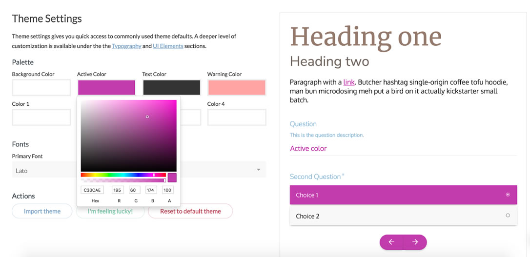
You can change the color of any group of elements in Bento using the visual colorpickers in the Customizer panel; the respective tabs are “Header Colors”, “Content Colors”, and “Footer Colors”. To change a color setting, click on the rectangle to the right of the “Select Colour”, which will open a hover control; there are three ways of interacting with the control: by clicking into any part of the square gradient area, by using the colored squares on the bottom (which will change the hue of the gradient area), and by using the draggable caret on the right, which will change the level of saturation. Apart from using the hover control, you can simply input the color in the hex notation into the field which appears next to the colorpicker once you click on it. To clear the value of the colorpicker, use the “Clear” button on the right of the active hover control. Do not forget to click on the blue “Save & Publish” button on top of each section to preserve your colors!

Visual Content Builder

Bento comes bundled with a powerful free content builder by SiteOrigin which allows easily creating awesome professional layouts from a set of “building blocks”, including text, images, buttons, grids, widgets, and many more. Its use is not required for Bento to work, yet your webmaster experience will be much more pleasant with the content builder installed. Upon activating the Bento theme you will see a prompt on top of each admin page recommending to install the Content Builder, which is as easy as clicking the link in the prompt. It is also recommended to install the second offered bundled plugin, the Extra Elements package, which will enhance your Content Builder with cool additional blocks such as galleries, sliders, post grids, etc. Alternatively, you can also install both plugins manually from the Plugins -> Add New admin section. After having installed both plugins you will need to activate them by clicking on the “Activate” link underneath the title of the respective plugin. You can also install the bundled plugins by visiting the Appearance -> Install Required Plugins admin menu section.

After activating both plugins it is advisable to visit the Plugins -> SiteOrigin Widgets and click the “Activate” button on every available widget since some of them might be disabled by default. Moreover, it is recommended to visit the Settings -> Page Builder admin section and tick the checkboxes of the content types you wish to use the Builder with, in the “Post Types” option inside the “General” tab.

Please note that due to the way the theme generates grid pages, the Post Loop element of the Content Builder will not create a grid if you choose the “content-grid.php” in the “Template” drop-down. If you need a post grid, you’re better off using either the theme’s built in template or the “Simple Masonry” widget supplied by the SiteOrigin Builder.

For a detailed guide on using the Content Builder, including high-quality tutorial videos, as well as widget-related support, please refer to the official manual.

Post Formats

There are six post formats in Bento, which can be switched between using the “Format” settings box on the right side of the post editor mode view:

  1. Standard – the default format, used for displaying the text, images, and other content in a normal way.
  2. Aside – intended for shorter remarks, thoughts, announcements, etc. This format does not display a title.
  3. Gallery – used for gallery-type posts, such as photo collages.
  4. Quote – pre-formatted for displaying quotes; the content of the post becomes the text of the quote, and the title of the post is used as the author of the quote. It is recommended to use plain-text mode for quote-format posts instead of the Content Builder mode.
  5. Link – useful for recommending specific links; the title of the post is used as the text (anchor) of the link, while the URL of the first link within the content of the post will be used as the link destination.
  6. Image – intended for displaying single images.

Advanced Page Headers

Pages, posts and other content types in Bento can display full-width headers with text and button overlays like seen on the theme demo homepage or this page. To enable this feature, tick the “Activate Extended Header” checkbox in the “Page Header Settings” section underneath the content area in page editor mode. Doing so will expand a set of additional options which such as defining the height of the header by setting the padding above and below the title, customizing the coloured semi-transparent overlay to increase readability of the title, as well as adding primary and secondary action buttons to the header. The header image itself is sourced from the post/page featured image, which can be added via the native Featured Image box on the right side of the page edit mode view.

In addition to the page/post title, it is also possible to add subtitles in Bento, which are sourced from the excerpt of the respective page. In case you do not see the “Excerpt” field while in the edit mode, please click on the “Screen Options” tab in the top right corner of the screen in edit mode and tick the respective checkbox.

The front page’s header image and call to action buttons can be added via the “Homepage settings” section of the Customizer. Since Bento version 2.0, it is also possible to assign a separate header image to the blog posts page – the controls can be found in the same section of the Customizer.

Please note that due to particularities of the WordPress templating system extended headers do not currently affect the WooCommerce shop page, as well as other archive pages, such as category, tab, or custom taxonomy archives.

Vector Icons

Bento comes with 500+ vector icons from FontAwesome, which you can use on any page or post by inserting a simple piece of markup: an <i></i> tag with a class which specifies which icon to use. For detailed usage instructions please refer to the official FontAwesome guide.

Translating Bento

The theme uses proper WordPress functions to wrap all localizable strings, which means it can be both manually translated and used with third-party translation plugins such as the free Polylang or the paid WPML. The files needed for a manual translation are located in the “languages” folder inside Bento’s main directory; for detailed instructions on translating themes manually please see this guide. In case a plugin requires inputting the theme’s text domain, please use “bento”.

WooCommerce + Bento

The theme is fully compatible with the world’s most popular free e-commerce WordPress plugin, WooCommerce. The plugin is free software and is not included within the theme, i.e. it must be installed separately to activate Bento’s WooCommerce features. No additional steps are required from the theme’s side after the installation of WooCommerce – however, you can adjust certain additional parameters in the “Website Elements” tab of the Customizer panel For a demonstration of how Bento works with WooCommerce, please see the “E-commerce” section of the official theme demo.

The grid page template in Bento works just as well with WooCommerce products – you can tick the “product” option in the “Content Types” setting found in the “Grid Settings” box which appears underneath the content area when switching to the “Grid” template in the page editor mode in order to create project grids or even mixed post+project grids. The “Masonry Tile Settings” box also works for individual products (enter the editor mode for the product and scroll to the bottom of the view) for customizing how a particular item will look as a tile in a masonry grid.

Please note that the extended header feature does not currently affect the default WooCommerce shop page due to the limitations of the WP templating system. In case you need a shop with a header image, you can create a new static page, set it to Grid template, and choose “products” as the source of grid items in the “Grid Settings” box underneath the main content edit area. DO NOT set this new page as the WooCommerce shop page, since doing so will prevent the header image from being displayed.

Importing Demo Content

There is a sample data file available for Bento which includes all data from the official theme demo, it can be downloaded here (please right-click on the link and choose “Save As” in the popup dialogue). In WordPress, you can import data by going to Tools -> Import, clicking on the WordPress installer and installing it in the pop-up window, then clicking “Activate Plugin & Run Importer”, and choosing the xml content file to upload. After you press “Upload file and import”, do not forget to check the “Download and import file attachments” box (you can also set the author for the imported posts in the same screen, but that is not mandatory), then press “Submit”. In case you do not have the WooCommerce plugin installed, the “product” and “product tag” items will return errors when imported – you can ignore the error messages in this case. In case you install WooCommerce after importing demo content, the demo products will not be visible and will need to be imported anew – you can use this separate source file to do it. Moreover, in case you install the Bento Expansion Pack after importing demo content, the demo projects for the portfolio will not be visible and will need to be imported anew – you can use this separate source file to do it.

Please note that the sample data does not contain any settings in the “Settings” admin section or any Customizer panel settings; you will also need to assign the menus to their respective locations – make sure that the theme location checkbox is checked in the “Menu Settings” section right under the menu constructor in the Appearance -> Menus admin section.

Child Themes

It is highly recommended to use a child theme for any modifications to Bento code – this way your changes won’t get overridden when a theme update occurs. A minimal sample setup for a child theme can be downloaded here; more information on using child themes can be found in this part of the official WordPress knowledgebase.

Frequently Asked Questions

The website went blank after updating the theme to a newer version; what gives?
Please completely remove the existing version of the Expansion Pack plugin and install it anew using this source; after that, refresh you web page – in case the issue is not fixed at that point, please let me know and I will investigate further.

I have uploaded the theme manually but upon pressing “activate” the system returns a white screen and the website stops working. What the hell is wrong?!
Don’t panic :) It is most probably due to your hosting server running out of php memory, breaking the website when you tried to install an additional item. What needs to be done is to add the following line to wp-config.php file in the root folder of the WordPress website:

define('WP_MEMORY_LIMIT', '2048M');

If this does not work, try doubling the figure in the brackets; if still broken, please contact us.

I have uploaded the theme manually and it shows the message “Are you sure you want to do this? Please try again.” What went wrong?
Please upload the unzipped theme folder (it should have the name “bento”) into the “wp-content/themes/” directory of your WordPress installation using an FTP client – some hosting providers have small file upload limits for user convenience which limits the usage of WordPress’ internal theme uploader. After that, visit the Appearance -> Themes admin page, locate the newly uploaded theme from the list, and click “Activate”.

All portfolio projects I create with the Expansion Pack display a 404 error (“page not found”).
Please try visiting the “Settings -> Permalinks” admin section and clicking on the blue “Save Changes” button without adjusting anything. After that, refresh the portfolio page in your browser and try to access the project pages.

License

Like WordPress itself, Bento is licensed under the GPL (GNU General Public License) and is free for personal and commercial application – use it to make something cool, have fun, and share what you’ve learned with others.

Changelog

2.2 / 29 August 2019
Improved main menu behaviour on sertain mixed one-page setups.
Fixed header background color on scroll for centered header configurations.
Fixed menu text color setting as applied to second-level submenu items.
Fixed the bug that prevented the SiteOrigin widget block from displaying properly.

2.1.3 / 10 July 2019
Fixed page excerpts for pages with Grid template.

2.1.2 / 8 July 2019
Improved compatibility for admin scripts.

2.1.1 / 20 June 2019
Improved thumbnail support for custom post types registered by third-party plugins.
Fixed scroll position for same-page menu links with active full-height page header.
Fixed the Grid settings animation for classic editor mode.

2.1 / 26 March 2019
Fixed compatibility issues with the Gutenberg editor.
Added extra styling for the admin metaboxes.

2.0.6 / 6 February 2019
Improved side menu scrolling for very long menu cases.

2.0.5 / 26 November 2018
Updated theme screenshot to comply with the latest requirements.

2.0.4 / 22 October 2018
Fixed mobile logo sizing for side-menu layout.

2.0.3 / 27 September 18
Standardized button appearance across all browsers.
Fixed copyright displaying in the theme footer.
Updated theme translations.

2.0.2 / 20 July 2018
Added more blog page controls to the “Homepage Settings” tab of the Customizer.
Fixed the behaviour of the extended header elements on blog posts pages.

2.0.1 / 11 July 2018
Fixed the CMB2 admin notice bug.
Added extra functions for the Expansion Pack.
Fixed the text float issue on aligned images inside content.
Fixed submenu chevron positioning for larger menu font sizes.

2.0 / 29 June 2018
Replaced all Isotope layouts in the theme with modern CSS grids, removed Isotope dependency.
Added a category filter for grid pages.
Added item ordering options for grid pages.
Added site-wide options for page/post sidebars layouts.
Blog posts page can now have an image header.
Completely rewrote the Customizer scripts using Customizer JS API.
Replaced Font Awesome internal dependency with a CDN.
Improved primary menu CSS for higher robustness and customizability.
Fixed side-menu layout styling issues.
Replaced submenu menu chevrons with analogous Dashicons.

1.8.1 / 27 February 2018
Updated the bundled CMB2 library.
Updated the bundled FontAwesome set to v5.
Improved the behaviour of the “Hide thumbnail” post option.

Version 1.8 / 29 December 2017
Improved WooCommerce single product page styling.
Removed animations from footer widget nav menus.
Included backward-compatibility for the custom logo function.
Fixed scroll position for the same-page links from the CTA buttons in the presence of fixed header.

Version 1.7.9 / 8 December 2017
Added a Spanish translation.
Fixed sidebar behavior on blog index-template pages.

Version 1.7.8 / 9 November 2017
Submenus in side-menu layout now stay open on pages corresponding to active submenu items.
Masonry grid now behaves better on page resize with side-menu layout.
Added the “target” attribute to allowed html for the footer copyright.

Version 1.7.7 / 25 October 2017
Fixed the full-width grid behaviour in the presence of side-menu.
Fixed the bug which prevented the new breakpoint for fixed header on scroll.
Fixed thumbnail display with active extended header on static pages.

Version 1.7.6 / 2 October 2017
Fixed scroll positions for same-page links in the absence of fixed header.
Posts with excerpts now display the excerpt on the native blog page.
Added more robustness to the one-page links js function.
Fixed margins for the first stretched Content Builder element.

Version 1.7.5 / 8 August 2017
Fixed thumbnail visibility for posts with active Extended Header
“Hide featured image” option now also hides thumbs on native blog page.

Version 1.7.4 / 17 July 2017
Improved the presentation of item content in column and row grids.
Fixed html tag rendering in grid items of quote format.
Fixed duplicate featured images on grid pages with active extended headers.
Removed unneeded arrows from grid page excerpts.

Version 1.7.3 / 11 July 2017
Fixed thumbnail behaviour on pages with active extended header.

Version 1.7.2 / 10 July 2017
Fixed content width for the SiteOrigin Features widget.
Fixed side menu width for boxed site layout.
Fixed grid image for posts and projects with active extended headers.

Version 1.7.1 / 19 June 2017
Fixed call to action button alignment settings with extended header being switched on.
Fixed the default logo line height for long site titles.
Fixed mobile menu scroll behaviour for one-page setups.
Adjusted the fixed header position with active admin bar.

Version 1.7 / 11 May 2017
Moved the mobile styles breakpoint to a smaller width (1024px).
Added a control to change the logo padding.
Fixed mobile menu z-index order for cases with transparent header.

Version 1.6.7 / 25 April 2017
Updated the included CMB2 library.
Fixed header overlay and tile overlay opacity setting saving.
Removed hyphenation from the stylesheet.

Version 1.6.6 / 12 April 2017
Fixed submenu behaviour with active sticky header given that a page is loaded in the middle.
Added a more universal fix for the same-page menu item highlight on scroll.
Added product gallery features support for WooCommerce 3.0+.

Version 1.6.5 / 7 April 2017
Added full pingback support in the theme using native WP functions.
Improved the function that determines the number of WooCommerce shop columns.
Fixed the appearance of the WooCommerce Star Rating filter widget.
Fixed same-page menu item highlight on scroll.
Fixed the sticky header positioning when loading the page in the middle.

Version 1.6.4 / 3 March 2017
Fixed the featured images control visibility issue for the project content type.
In case of empty logo the theme now displays site title in its place.
Replaced the theme screenshot with a more accurate one.
Replaced the front-end welcome header with an admin page.
Removed Expansion-Pack-specific metaboxes from the front-end.
Moved the option to edit the credit link in the footer into the Expansion Pack.
Corrected the name and description of the colors section of the Customizer.
Fixed the output of the “link” and “quote” format posts and linked to single post view.

Version 1.6.3 / 13 February 2017
Added the header image upload field for the Expansion Pack.
The bottom footer does not display at all now if the footer menu and the copyright statement are blank.
Fixed the featured image behaviour in the presence of extended header on Grid pages.

Version 1.6.2 / 5 February 2017
Fixed the “Hite title” option on WooCommerce product pages.
Removed the unnecessary “Hide thumbnail” setting from pages.
Removed Facebook and Twitter links and fixed the rating link in the Customizer
Added notes on site title and tagline into the readme file.
Moved the “Tile image” field into the Expansion Pack.
Corrected handles for third-party scripts and styles.
Updated the included CMB2 library.

Version 1.6.1 / 1 February 2017
Corrected the text domain in the translation function which sets sidebar names.
Added unminified versions for all minified js files included in the theme.
Replaced custom comment function arguments with hooks.
Added the pagination link mechanism to page template.
Removed the “create-function” call from the WooCommerce “loop_shop_per_page” hook.
Removed theme prefixes from third-party script-enqueue handles.
Escaped all input for the wp_localize_script(), image URLs in the logo function, and category lists in post meta.
Replaced the json_encode() with the native wp_json_encode() function.
Moved the register_nav_menus() function inside the after_setup_theme() call.
Removed the excessive function_exists() check for the register_nav_menus() call.
Wrapped admin strings for plugin activation module into proper localization functions.
Added a reset to the custom grid query.
Switched to home_url() in the custom WooCommerce search function.
Removed the unnecessary “page-” prefix from the grid template.
Removed excessive escaping for the get_search_query() function.
The search form now fills with existing search query using the get_search_query() function.
Removed the excessive post date from the bento_entry_meta() template function.
Wrapped the year in the theme footer into a localization tag.
Fixed the unordered multiple placeholders issues included libraries
Removed the error control operators from the included CMB2 library.

Version 1.6 / 25 January 2017
Moved all theme-related support and upsell links into a single native Customizer section.
Removed all premium sections and fields from the Customizer for non-upgraded users.
Got rid of the ‘add_option’ call on theme activation.
Displaying the novice header only to users with admin capabilities.
Got rid of any separately stored additional options.
Added the user-defined website title with home link to the copyright notice in the footer.
Moved some of the page/post meta settings to Customizer or the Expansion Pack.
Replaced the global $post calls with get_queried_object_id().
Replaced the deprecated woocommerce_get_page_id().
Moved the custom site background option to the native Customizer functions.
Replaced the logo-related calls with native WP functions.
Replaced site_url() with home_url().
Added has_nav_menu checks for all theme-defined menu locations.
Replaced the custom excerpt-generating function with the native WP function and filters.
Defined the content width variable using a global.
Moved the custom CSS theme option to the WordPress native setting.
Escaped all user-inputted data on output for improved security.
Switched to the native WP imagesLoaded script.
Enqueuing admin scripts only on necessary screens.
Removed the redundant register_script() function calls.
Made menu and sidebar names translation-ready.
Removed the upload_mimes filter from the theme.
Corrected license version inconsistensies across theme files.
Added a readme file with theme information and credits.
Improved WooCommerce cart styling on smaller screens.
Fixed search form icon when used as a SiteOrigin widget.
Fixed Content Builder elements overlaying the mobile menu.
The fixed header now fits inside the boxed website layout.

Version 1.5.5 / 25 October 2016
Fixed bug in masonry grid image urls.
Fixed “post types” multicheck for “grid” pages.

Version 1.5.4 / 22 October 2016
Updated the CMB2 included library.
Sanitized all output instances.

Version 1.5.3 / 21 October 2016
Adjusted the way the CMB2 library is included into the theme.

Version 1.5.2 / 18 October 2016
Prefixed all hooks in the included php libraries.
Reverted to non-prefixed names for JS library enqueues.
Included favicon using native WordPress functionality.

Version 1.5.1 / 9 October 2016
Improved the way Google Fonts are added to the theme.
Added theme prefixes to all external libraries and custom classes.

Version 1.5 / 7 October 2016
The “hide title” setting now also works if the extended header has been activated.
Added an option to hide the featured image on posts and projects.
Mobile menu now closes also on touching outside the menu.
Fixed scroll position on page load with hashed URLs and fixed header.
Fixed oversize logo fit on side-header configuration in IE11.
Fixed the duplicate subheading issue for extended header.
Added sanitization to all output fields.
Corrected HTML validation errors.

Version 1.4.1 / 16 September 2016
Fixed content width bug in the Customizer.
Fixed individual page/post setting effect scope.
Added defaults to all get_theme_mod calls.

Version 1.4 / 12 September 2016
Migrated theme options into the native Customizer.
Moved non-theme functionality into the Expansion Pack.
Optimized and streamlined the functions.php theme file.
Fixed pagination links for Grid page template on static front page.
Updated JS breakpoints from pixels to em units to sync with CSS breakpoints.

Version 1.3 / 23 August 2016
Added highlight for the current position in the footer menu.
Fixed mobile menu animation on iOS.
Fixed sidebar logic in the absence of sidebar widgets.
Fixed Google maps header behaviour for maps without custom styles.
Fixed post meta for posts in Uncategorized category.
Fixed header menu submenu styling on transparent headers with large logos.
Fixed theme welcome screen on side-header configuration.
Added full translation into Ukrainian (special thanks to Vadim Chernobublik).
Improved footer widget area compatibility with Polylang plugin.
Fixed Theme Options tab navigation beaviour in Firefox in cyrillic languages.
Fixed Google Fonts appearance in Safari for latin-ext and cyrillic characters.
Fixed sidebar on WooCommerce shop category pages.

Version 1.2 / 23 June 2016
Added a possibility to upload a separate logo for mobile devices.
Site header custom color now also applies to fixed header.
Fixed Theme Options framework bug in php 7.
Fixed the bug with the “Hide title” setting for Grid pages.
Header background color setting now also affects side header layout.
Added full translation into French (special thanks to ThemeCloud.io)

Version 1.1 / 16 May 2016
Added a possibility to upload a separate tile image apart from thumbnails.
The heading font setting in Theme Options now affects extended header headings.
Added full translation into Russian.
Fixed compatibility of link colors with user-defined styles in Content Builder.
Fixed sidebar layouts for pages that were created using other themes.

Version 1.0.2 / 20 February 2016
Fixed the submenu animations and styling for “side” menu layout.
Added extra padding to the mobile menu in the absence of logo.
Hiding mobile menu elements if no menu has been created.

Version 1.0.1 / 4 February 2016
Updated theme screenshot.

Version 1.0 / 3 February 2016
Initial release.

Bento Expansion Pack

About the Expansion Pack

Bento Expansion Pack is a plugin that has been developed by the authors of Bento in order to add more capabilities to the theme. It’s easy to install and offers a host of cool additional features such as portfolio functionality, pre-built layouts, video and maps headers, preloaders, and many more. The Expansion Pack also allows to fully customize the copyright statement in the footer, removing all our branding. The Pack can be downloaded here for $25 (one-time payment), which includes support and lifetime updates; this is about 2-3 times less than what you’d need to pay for a premium theme elsewhere.

Version: 2.0 (changelog)
Expansion Pack demo: satoristudio.net/bento, “Expansion Pack” menu section.

License

The Bento Expansion Pack is licensed under the GPL (GNU General Public License); one purchase of the Expansion Pack offers one activation key, which is in turn valid for two activations – i.e. it can be used to activate the Expansion Pack on two separate instances of WordPress, be it on individual domains, subdomains, or localhost setups. The second activation has been primarily included for the sake of giving an opportunity to configure the Expansion Pack on a test environment (e.g. Localhost or separate dev URL) before using it on a live website.

Installation

Please follow these steps to install and activate the Expansion Pack:

Step one: install the Expansion Pack.

  1. Purchase the Pack at the bottom of the official page and download the archive using the link in the purchase confirmation email which is sent automatically to the email address you’ve indicated during the checkout.
  2. After downloading, please visit the Plugins -> Add New section in your website’s WordPress admin panel and click on the “Upload plugin” button on top of the page, next to the heading.
  3. After that, click on “Choose File” and navigate to the archive you’ve downloaded from the link in your confirmation email, then press “Open”.
  4. When the pop-up window closes, click on the “Install now” button that appears in the center of the screen and wait for the magical fairies to do their thing.
  5. After the installation has completed, click on the “Activate plugin” link.

Step two: activate the Expansion Pack

  1. After installing the Pack, visit the Plugins -> Bento Expansion Pack Activation section in your website’s WordPress admin panel.
  2. Input your licence key – the long string of letters and numbers seen above in this email – into the field, and click on the “Activate license” button.
  3. A green success message should appear. Great success! The new features and options will be available from the Appearance -> Customize admin section.

Updating Bento Expansion Pack

Since version 2.0, Expansion Pack has received an auto-update routine which periodically checks for available updates and displays a notification if a newer version of the plugin is available. If you see such message next to the Expansion Pack in the Plugins – Installed Plugins section of the admin panel, simply click on the “update now” link to bring your version up to date.

Alternatively, you can also manually download the latest version of the Expansion Pack at any time using the download link from the automatic email you received after your purchase. After obtaining the “bento-expansion-pack.zip” archive, unzip it and upload the resulting “bento-expansion-pack” folder into the following directory inside your WordPress installation: /wp-content/plugins/ using an FTP client or your hosting provider’s file manager. Agree to replace all existing files if prompted.

Included Features

The current version of the Bento Expansion Pack augments the theme with the following features, and more are being added all the time:

  • Fully customizable or removable footer copyright message.
  • Portfolio with various layouts and a new specialized content type called “project” (demo).
  • Beautiful prebuilt layouts for the Content Builder allowing you to create professional-looking pages in seconds (demo).
  • Fully customizable pop-ups for engaging and converting more visitors (demo).
  • A new element above the header in the form of a customizable full-width bar that can display any HTML, e.g. contact details or promo offers (demo).
  • “Under construction” mode which automatically redirects all non-logged-in visitors to the from page of the website, displaying a custom “coming soon” template (demo).
  • Customizable preloading animations for better user experience (demo).
  • Video headers which help your pages to stand out and leave an impression (demo).
  • Google Maps headers with customization and styling possibilities (demo).
  • “Twitter Feed” custom widget for displaying your latest tweets in your website’s sidebar or footer.
  • “Advanced Recent Posts” custom widget with additional options compared to the standard one.
  • Possibility to upload own fonts for displaying the website’s body, headings, and menu text.
  • Possibility to add a Google Analytics tracking snippet without touching the theme’s code.
  • SEO settings such as meta data for search engines.

The Expansion Pack adds 6 new sections to the Customizer panel:

  • SEO Settings – allows you to set the meta information for search engines.
  • Analytics Code – here you can insert the Google Analytics code to track your website’s traffic and other visitor data.
  • Call to Action Popup – enables you to activate and customize the call-to-action popup for converting your visitors.
  • Preloader – in this section you can activate and customize the loading animation for your website’s pages in order to improve user experience and only display fully rendered pages to your visitors.
  • Coming Soon Page (since 2.0) – allows activating and configuring the “under construction” mode.
  • Top Bar (since 2.0) – provides control over a new full-width section above the header.

After installing and activating the Bento Expansion Pack you will be able to customize or fully remove the copyright message in the theme footer – just input your own text or HTML into the “Copyright message in the footer” field in the “Site Identity” tab of the Customizer panel.

Portfolio and Projects

The Expansion Pack adds a new custom content type to the Bento theme: the so-called “projects”, which are pre-styled for showcasing work by creative agencies, service providers, freelancers, photographers, etc. The projects function similarly to the classical WordPress posts and be can created by visiting the Portfolio -> Add New admin menu section. There is a separate specialized taxonomy for projects which is called “types” (Portfolio -> Types admin menu section) which works just like categories do for classical WP posts, and which can be used to differentiate between the projects and construct filters used on portfolio pages; you can specify one or more types for any particular project by using the “Types” settings box in the right part of the editor mode view.

In order to display your projects, you can use the existing layouts and features found in Bento, namely the “Grid” page template. After successfully activating the Expansion Pack, the “project” content type becomes available in the “Content Types” checklist found in the “Grid Settings” box which appears underneath the content area when switching to the “Grid” template in the page editor mode. You can use this setting to create grids of projects or even combined grids displaying both projects and posts or projects and products, or all three content types. In case only “project” is chosen as the content type to display on a particular grid page, that page will automatically display a portfolio filter based on which “types” you assign to each of the projects (see portfolio filter demo here).

In case the project pages you create display a 404 error (“page not found”), please try visiting the “Settings -> Permalinks” admin section and clicking on the blue “Save Changes” button without adjusting anything. After that, refresh the portfolio page in your browser and try to access the project pages.

Prebuilt Layouts

The Expansion Pack includes a continuously expanding set of pre-formatted page layouts for the Content Builder, designed to fit specific needs, such as product homepages or corporate landing pages (see live demos here). These pre-packaged layouts have been built with the aim of saving your time by offering a fast and easy way of setting up professional-looking pages.

Currently the Expansion Pack offers the following pre-built-layouts:

  • Product Homepage With Slider
  • Corporate Homepage
  • Creavite/Agency Homepage
  • Coming Soon Page

In order to make use of the pre-built layouts, you will need to have the Content Builder and the Extra Elements plugins installed (see this section of the current manual for more details). The layouts are accessible for all users of the Bento Expansion Pack by switching to the “page builder” mode (click on the respective tab in the top right corner of the content area while editing a page) and clicking on the “Prebuilt Layout” button in the content area – in case the page is new you haven’t added any content yet – or clicking the “Prebuilt” button in the top left corner above the content area. The available layouts are found under the “Theme Defined”. Each layout contains placeholder text and icons, so after applying a layout you will only need to replace those with your own text and icons by editing each respective section; you can, of course, modify any of the layouts in any way you require, using them as a basis for creating more custom pages.

Popups For Converting Visitors

Visitor engagement is one of the most important success metrics for almost any website, which is why the Expansion Pack features a tool to help you transform more visits into actions using specialized pop-ups (see a demo here). It is a popular method of motivating website visitors to perform a specific task, such as signing up for a newsletter or clicking a button, or even purchasing a product / service. In order to set up a converting pop-up with the help of Bento Expansion Pack, please follow these steps:

  1. Create a page that will serve as the content of the pop-up (Pages -> Add New admin menu section); it can include any text, images, Content Builder elements or layouts, as well as third-party shortcodes such as contact forms, social widgets, etc.
  2. Visit the “Call to Action Popup” tab of the Customizer panel and choose the page you’ve created in step 1 from the “Source of content for the popup” drop-down.
  3. In the same tab, choose where to display the pop-up using the “Display call to action popup” setting and set the trigger using the “Popup trigger” setting.

The “Call to Action Popup” tab of the Theme Options panel mentioned in the steps above also contains auxiliary settings to fine-tune your pop-up, such as the width of the pop-up window, its border thickness and color, as well as overlay color and opacity.

Please note that pop-ups use cookies to only display once per session to each user; in other words, once the pop-up is shown to a particular visitor, it will not appear again to that particular visitor until they close their browser window. This is done in order to minimize the chances of the pop-ups becoming annoying to your website’s visitors.

Preloader

Bento Expansion Pack allows displaying a loading animation to the visitors while a page is loading in the background in order to only display the fully loaded page to the viewers and at the same time to let them know that the process of loading the page is underway (see the preloader in action here). The preloader can be activated and configured in the “Preloader” tab of the Customizer panel.

Top Bar

Since version 2.0, you can activate and configure a new site element with Bento Expansion Pack – a full-width bar above the header. It can contain any text or even HTML and can be customized in terms of color palette and content alignment. All settings for the top bar can be found in the respective tab of the Customizer panel.

Coming Soon Mode

Since version 2.0, the Expansion Pack offers the possibility to switch to an “under construction” mode for your website, which means all non-logged-in visitors will be automatically redirected to the front page, which, in turn, will utilize a custom template with no navigation and other details. You can pick any existing page as the basis for the content of the “coming soon” page, all related settings can be found in the “Coming Soon Page” tab of the Customizer panel. When the “coming soon” mode is active, only the site admins are able to see the full website, which allows for hassle-free launch preparations.

Video Headers

One of the new types of headers available in the Bento Expansion Pack is full-width video – an additional setting in the extended header which allows uploading a video file to display as a background of the page title (see demo here). The .mp4 file format is recommended for the video files, yet you can also use .ogg and .webm files. The smaller the size of the file you’re using, the better for user experience and SEO, it’s recommended that the size of the video file does not exceed 2-3 Mb; using a Content Delivery Network is highly encouraged to increase loading speed and reduce server load.

Please note that it is still recommended to upload a static header image using the “Header Image” field in the same settings section in order to have a fallback for the cases when the video fails to load or play. Moreover, the image will display as the header on smaller devices since the video will automatically be hidden in order to save on data service bandwidth. When defining a video background, you can use all other extended header settings and features in a normal fashion; if you wish to revert to displaying a static image header, click on “Remove” under the video you’ve uploaded and save changes to the page.

Google Maps Headers

In addition to video headers, the Expansion Pack allows creating headers with functional maps using the Google Maps API v3 (see live demo here). In order to set up such a header you need to check the “Activate Google Maps header” checkbox in the “Map Header” settings section underneath the content area in the page editor mode. After that you will be able to set the parameters for the map, such as its centering point, zoom level, and height, as well as define a custom style for the map using your own code or the ready-made snippets from Snazzy Maps; to achieve the latter, navigate to the page of the style you like and click on the “Copy” button or simply select and copy the code under the “Javascript Style Array” heading.

It should be noted that the Google Maps header has precedence over the image/video header – in other words, in case you activate the map your header will display a map regardless of which settings you have in the “Page Header Settings” box.

Extra Widgets

Bento Expansion Pack adds the following widgets to the standard WordPress selection in the Appearance -> Widgets admin section:

  • Twitter Feed – a configurable stream of tweets from a specific Twitter account. Since Twitter requires creating an application in order to display its data on third-party websites, please follow the instructions in the widget settings area to set up the required data.
  • Advanced Recent Posts – a take on the standard WordPress “Recent Posts” widget offering more display elements such as thumbnails and more links as well as more customization options.

All widgets above are pre-styled to work seamlessly with Bento’s Customizer panel color settings.

SEO settings

After activating the Expansion Pack you will notice a new section in the page/post edit mode view, beneath the main content area: the “SEO Settings” box allows defining the meta title and description for each individual page without having to introduce additional strain on your WordPress website by installing a separate SEO plugin.

In addition to that, the new “SEO Settings” tab added by the Expansion Pack to the Customizer panel allows you to set the front page meta title and description (used by search engines such as Google and Bing), as well as customize the suffix added to all page meta titles.

Since version 2.0 of the Expansion Pack, there is also a possibility to turn off all SEO settings, preventing the plugin from generating any custom meta tags. This can be useful if you are willing to activate a third-party SEO plugin on your WordPress install. The checkbox for deactivating the SEO settings can be found in the respective tab of the Customizer panel.

Changelog

Version 2.0 / 11 July 2018
Added a top bar for contact details or other additional information.
Added a full-height header image option.
Added a pre-built layout for a coming soon page.
Content Builder tags are now stripped from meta descriptions.
Added a “coming soon” page option.
Added an option to disable all SEO settings.
Fixed the portfolio filter.
Set up automatic Expansion Pack updates from our server.
Fixed image import in pre-built layouts for the Content Builder.

Version 1.1.1 / 11 May 2017
Header video now switches to image at a smaller width.

Version 1.1 / 24 April 2017
Fixed a compatibility issue between EP maps and the Content Builder maps widget.
Made the Expansion Pack translatable.
Fixed the issue which prevented the EP widgets from being available in the backend.
Fixed file upload issue introduced by changes in WP core from 4.7.1.

Version 1.0
Initial release